
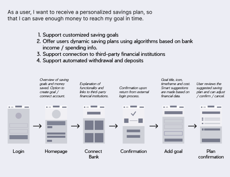
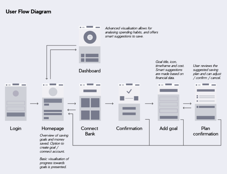


Design of Primary User Flow
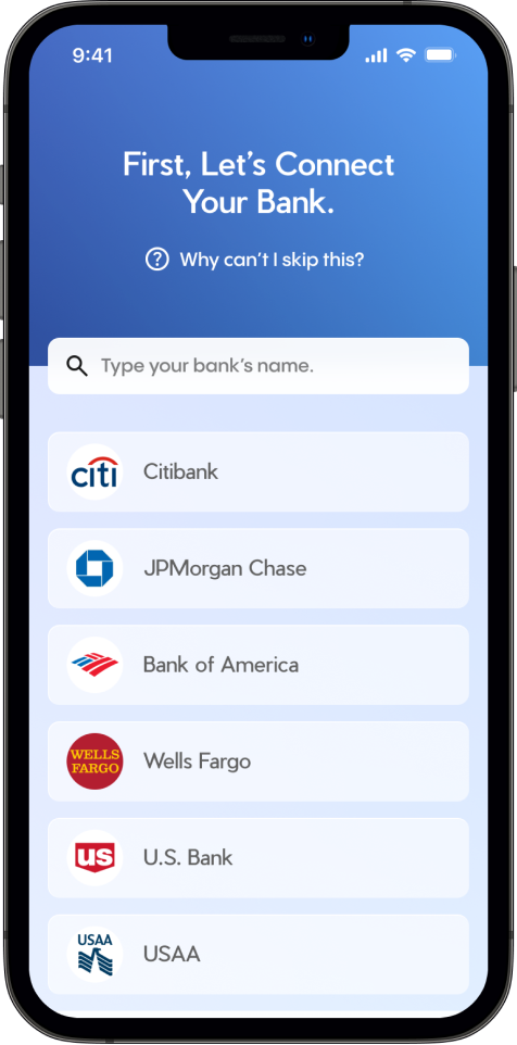
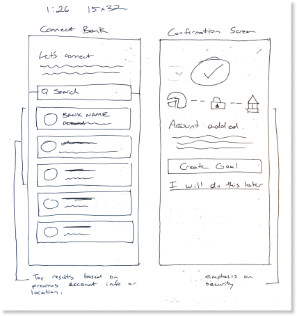
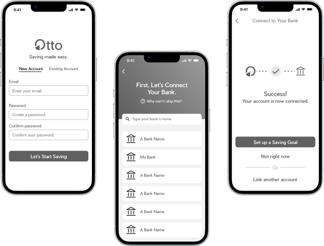
Connecting bank is a part of the app onboarding, and offering a help overlay menu helps to build trust.
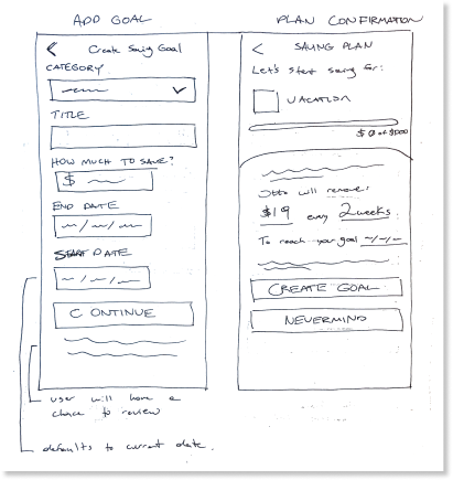
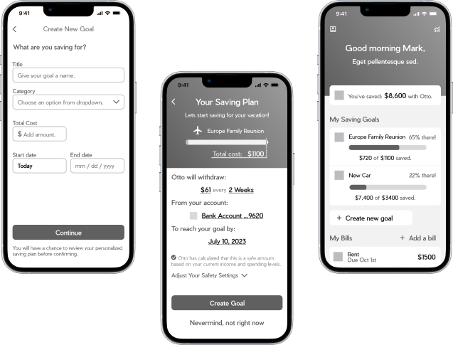
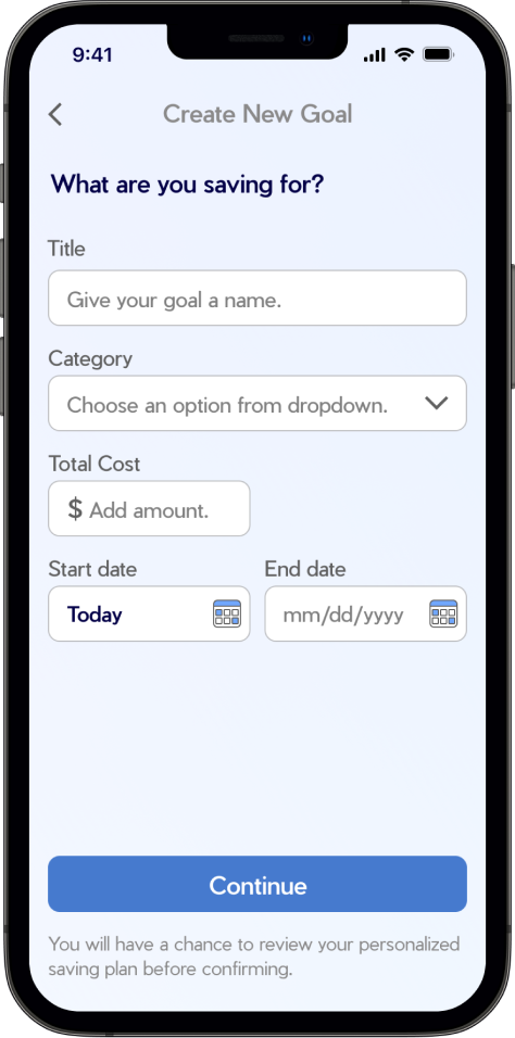
The goal creation screen is simple and consistent in style. The category dropdown accesses a variety of descriptions and icons.
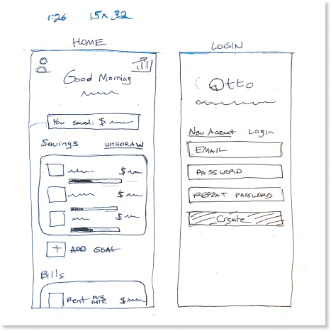
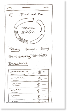
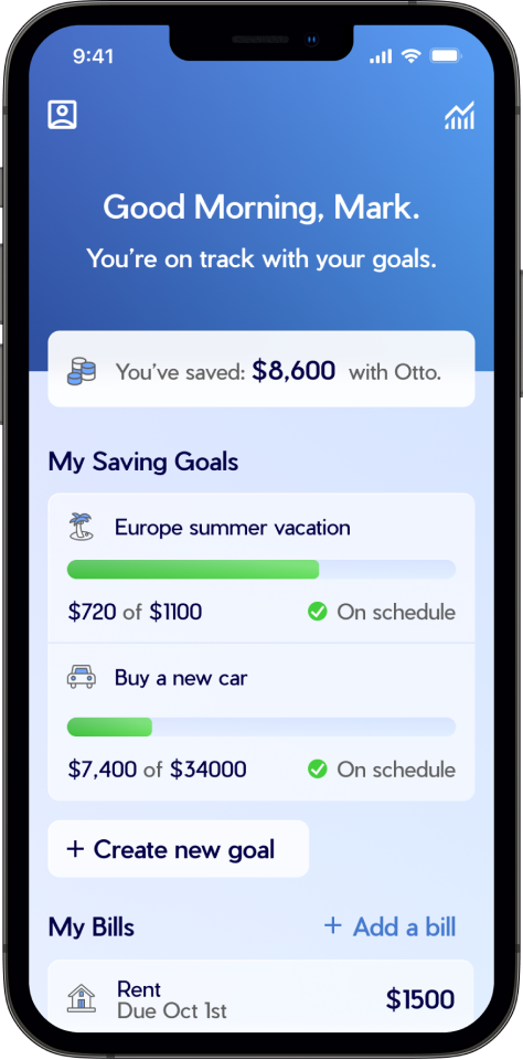
The goal is added to the home screen with animation to draw attention to the change of state. Traffic-light color-coded completion bars indicate whether you are on track.
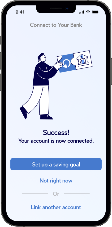
The Bank confirmation screen emphasizes security and offers access to the homepage if a user wants to look around before committing to a goal.
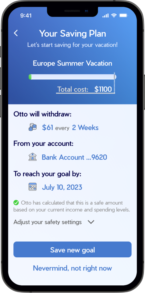
The plan summary allows users to understand what they are committing to. The app guarantees this is a safe amount based on bank records of income and spending.


