Wild Camp
Wild Camp is a responsive web app that I created to help users find location-based campground suggestions. I implemented an end-to-end design process from the early conceptual stages to the final product.

Context
- Case study
- My Role: UX Designer
Tools and skills used
- Figma
- Competitive Analysis
- User Research
- Affinity Mapping
- Wireframing
- A/B Testing
- Prototyping
- Style Guide
- Icon Design
- Responsive Breakpoint Design
Overview
Building a web app to help users find and book campsites.
My brief for this project was to create a location-based responsive web app to aid users in finding and booking campsites online. I began by exploring the problem space, conducting user interviews to pinpoint the challenges that users face, and developing iterative wireframes and prototypes. I arrived at a final polished design after designing the brand, the icons, and the overall user experience of this app.
The Problem
Finding and booking campsites online is challenging.
Users have to hop between different websites depending on whether they want to see private, commercial, or government campsites, and information about them is often thin.
Hypothesis
Users want a streamlined search process.
I had experienced how time-consuming the current process of finding campgrounds could be. I guessed that users would highly value a product that simplified this process and saved them time.
UX Phase
This project began with a complete UX process where I figured out what shape this app would take and what problems it needed to address.
While other apps on the market offer similar services, finding campsites is still far from streamlined. I conducted a competitive analysis in the beginning stages of this process using the following methods:
- Competitor overview
- Marketing profile
- SWOT analysis
- UX Analysis
I conducted these on two top competitors: The Dyrt and Roadtrippers. This analysis revealed weaknesses in opponents (such as low SEO performance) and UX shortcomings with opportunities for improvement (such as users being unable to create custom shortlists).


User Research and Affinity Mapping
While I perceived areas for improvement in my competitive analysis, the most important question was what the desires and frustrations of actual campers were. I conducted user interviews to determine what those were, digging into how users searched for campgrounds and planned trips and their desires and frustrations.
I collected the data points from my interviews and conducted an affinity mapping exercise, allowing me to identify many common themes.
One unexpected insight from these interviews was that all interviewees desired to search for campsites based on nearby activity or natural features, a function not prominently offered on competitor’s sites.

User Personas
Using synthesized insights from my user interviews, I went on to create user personas to guide the rest of the development process.
Campers are a diverse group of people with sometimes contradictory goals, which I represented using the following personas:
- Doug will almost always opt for an isolated backcountry experience.
- Mariah typically books a weekend glamping getaway.
- Sarah wants a safe and accessible city escape, without any noisy crowds.
These personas allowed me to highlight campers’ differences but also demonstrate what they had in common in their underlying motivations.

User Flows
With my user personas to guide me, I started tackling the problems that these users faced and the journey they could take through my app to reach solutions as efficiently as possible. I broke these down using a Jobs To Be Done framework and created user flows for each. I compiled these into a User Flow Diagram which I included in the MVP document for Wild Camp.

Rapid Prototyping / Medium Fidelity Wireframes
Having created Jobs To Be Done, I conducted a design sprint exercise to rapidly prototype screens central to these user journeys. I used the Crazy 8’s method as a framework for making these sketches so that I could brainstorm and validate various ideas quickly.
These sketches were ultimately dot-voted and led to the development of medium-fidelity digital wireframes. The progression from low to mid to high fidelity wireframes is shown below.

I also used these sketches to create an interactive paper prototype to conduct preliminary user testing and get early user feedback.
Home Page

Search Results (map view)

Campground info screen

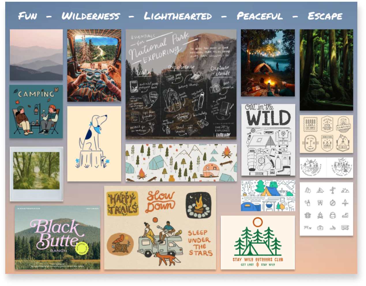
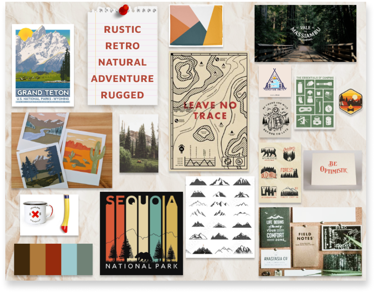
Mood Boards
Once I had completed the medium-fidelity wireframes, I began defining the product's visual and brand identity. I created two mood boards during this process, offering two alternate visual aesthetics. One mood board provided a more tranquil and fun direction, while the other had a more vintage aesthetic that appealed to a user's sense of adventure.
A/B Testing
I used the moodboards’ competing visions to design two screens that represented these two visual approaches. I then conducted an online preference test using Usability Hub.
Users were split:
- The results slightly favored Screen B, though only at 54%.
- However, collecting user comments about their choices also yielded qualitative data to guide my decision.
- Many users that chose Screen A said they did so because of better text contrast, while many that chose Screen B preferred the teal color.
- In the end, I went with screen B but changed the “Find Campgrounds” text to white to improve contrast, addressing feedback from both groups.
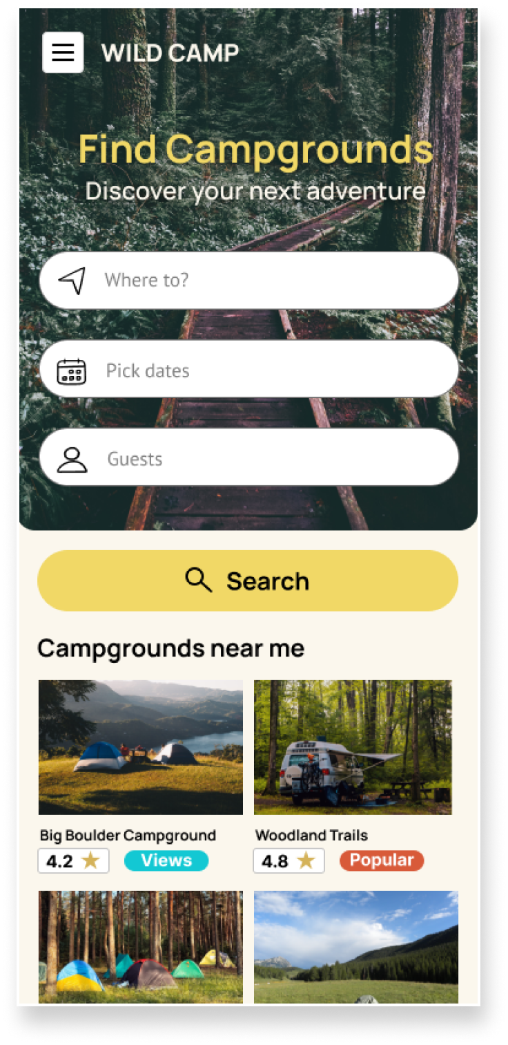
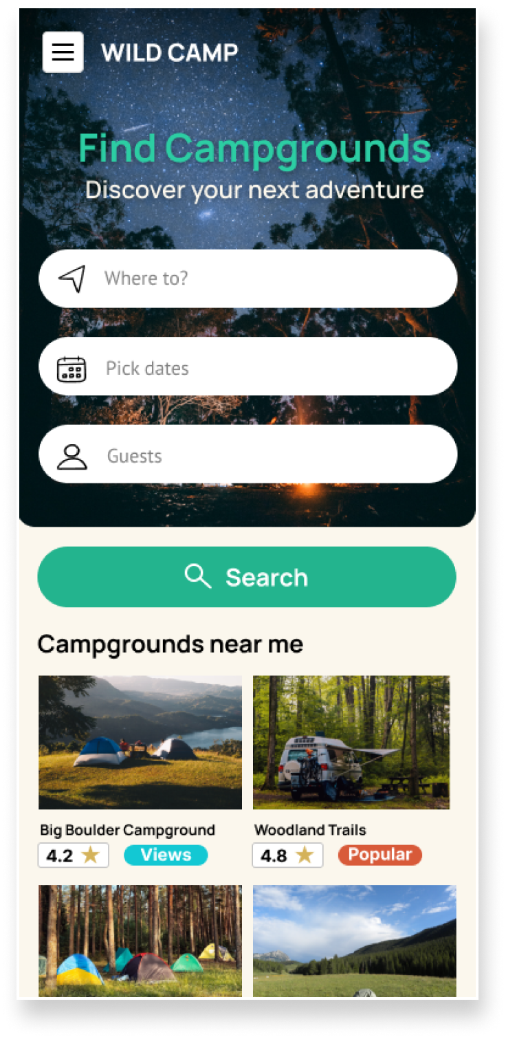
"Screen A" (yellow) and "Screen B" (teal) that were used to conduct this preference test.
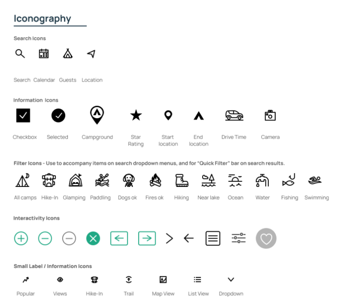
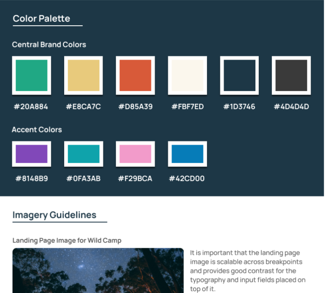
Style Guide and Icon Design
With a visual direction defined, I created a comprehensive style guide. I designed a custom icon set that aimed to be accessible and friendly in keeping with the visual identity I had defined. The complete guide covers typography, buttons, copy guidelines, and more.
Breakpoint Design
As a final step, I identified breakpoints for the screens and created an adaptive design that would look good across all devices. I employed progressive enhancement and adjusted layout patterns as screen size grew. On large screen sizes for the search results page, I arranged the list and map view to sit side by side to allow users the benefits of both.

When designing the homepage across breakpoints, I ensured that the "Inspiration" section appeared above the fold. Offering curated lists of destinations to users is a unique product offering, and I wanted to make sure people were aware of it on their first visit.

Finalized Designs
The final designs for Wild Camp demonstrated that the UI is consistent and cohesive across the product. These screens highlight how users can interact with the app to achieve their goals and serve as the basis for developing a successful first iteration of a live app.


Project Takeaways
I know from personal experience that researching and booking a campsite online can be arduous, and it was interesting to address this problem during this project. Some highlights from this project were:
- Project encompassed a complete UX / UI process.
- I identified how current products on the market were failing users.
- Users expressed a desire to filter results based on interest or activities, and I featured this functionality prominently in the final design.
- Interviews revealed less experienced campers had low confidence but a high motivation to engage in more advanced trips. I designed a backcountry guide to aid these users.
- I created an inspiration section on the homepage, which offers a quick solution for users with a particular type of trip in mind, and helps cut through the overwhelming amount of choice.