Wine Match
Wine Match is a shopping, recommendation, and learning app that helps users discover new wines.

Context
- Case study
- My Role: UI/UX Designer
Tools and skills used
- Figma
- Photoshop
- Competitive Analysis
- Native Design Patters
- Wireframing
- Prototyping
- Animation
- User Testing
- A/B Testing
Overview
An app to help users find and buy new wines.
I developed an MVP prototype for a new wine recommendation app for this project. The project brief required developing iOS and Android versions of a native app that demonstrated how it would provide users with customized wine suggestions and resources.
The Problem
How to inform and empower wine drinkers.
Many people who drink wine are overwhelmed by the options whenever they buy wine at the store or order it off a menu. As a result, people may stick to what they know, even if they want to try new or exciting wines. They may also enjoy certain wines more than others but are not able to articulate their personal preferences.
Hypothesis
If people know their personal preferences, an app that matches them with wines would be a valuable resource.
I aimed to design an app that helped users pinpoint what they enjoy in wines and then offer suggested wines that match their profile. Due to the variety of wines, even within a single varietal or region, this service could be a helpful time-saver for users.
Competitive Analysis
I turned to some of my competitor’s apps to investigate what design solutions they had used to solve similar problems and see what I could learn from them or what I wanted to avoid.
Many apps in this field suffer from a bloated and unattractive UI, and a central goal of Wine Match was to make discovering wine feel more accessible and easy. The overload of information and heavy visual design in other apps didn’t help.
However, other apps did have some good navigation and input UI patterns that I thought I could implement in my designs.
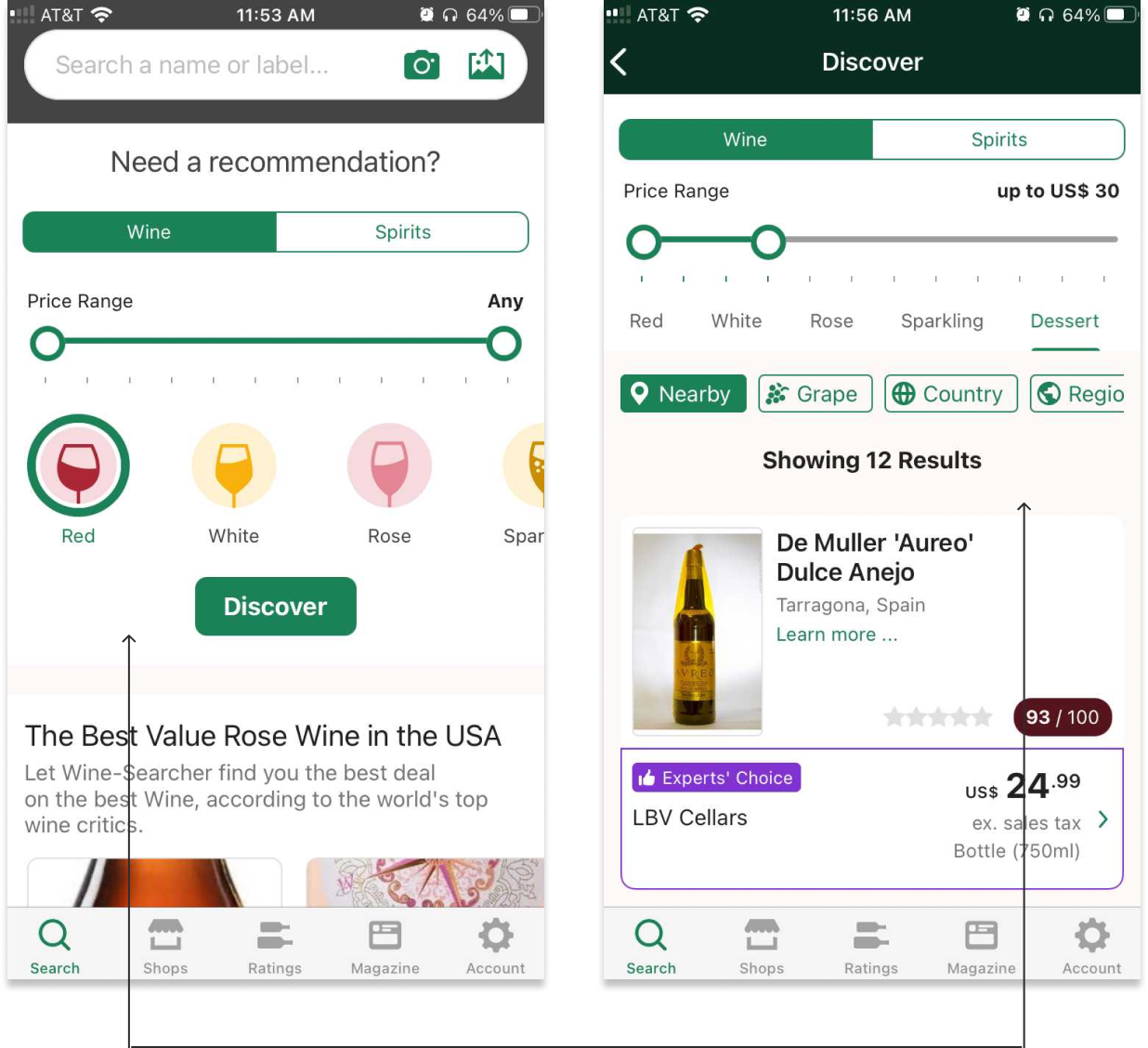
A graphic and intuitive search tool for recommendations is a very effective pattern on Wine Searcher’s search page. Filter options are offered on the results page, which keeps the initial search clean and easy to use.
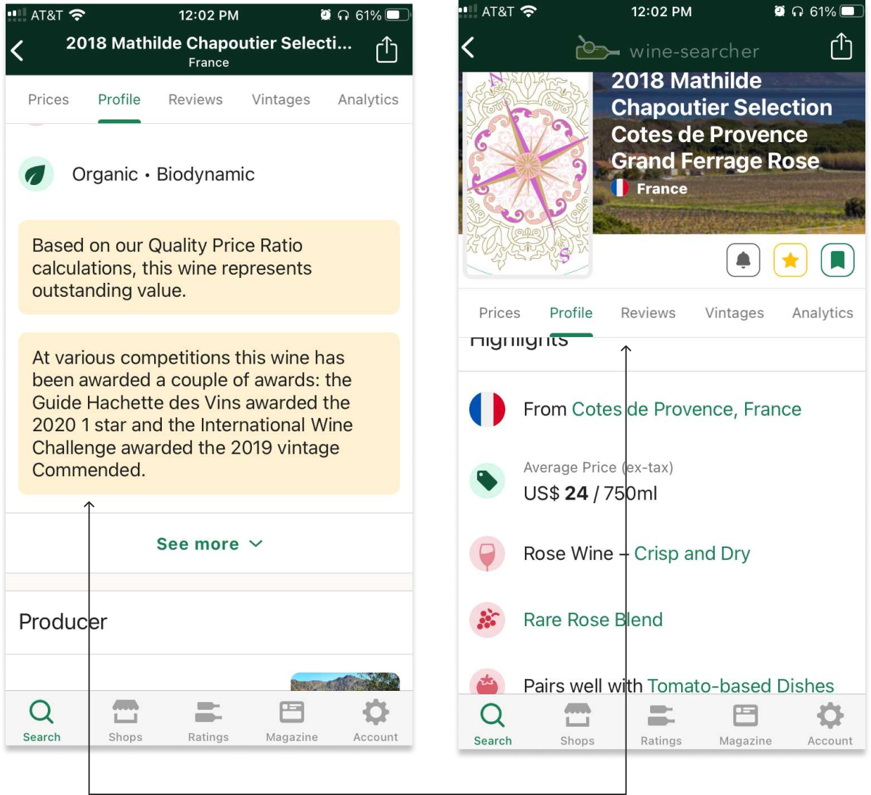
Tab navigation is highly functional on the wine page, where there is a lot of information to navigate, but the presentation of this information is bloated and unwieldy. Fewer navigation tabs and more expandable information bins could help alleviate this.
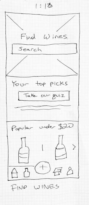
Low Fidelity Wireframes
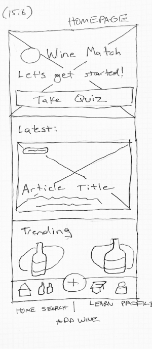
I began creating user flows and low-fidelity wireframes to sketch out how this app could:
- Offer users personalized recommendations for new wines to try.
- Allow users to quickly document wines that they try when out at a restaurant or bar.
- Offer users editorial and news content that makes them feel more knowledgeable about wine.
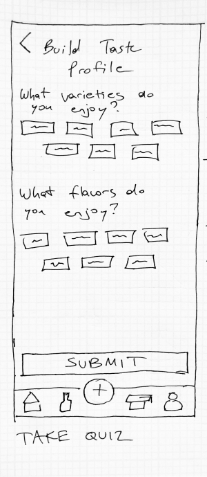
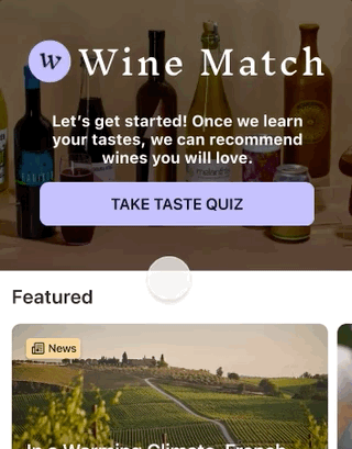
To achieve this, I designed a quiz that allows the app to learn a user’s tastes and offer suggestions based on the results. Users can also scan a bottle label or wine menu with their phone’s camera and find that wine in the app so that it can be saved or rated.
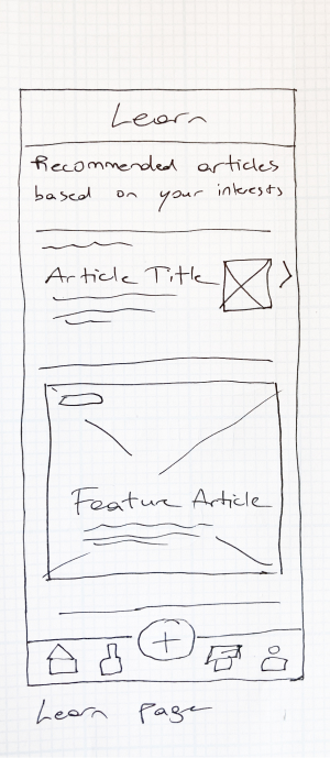
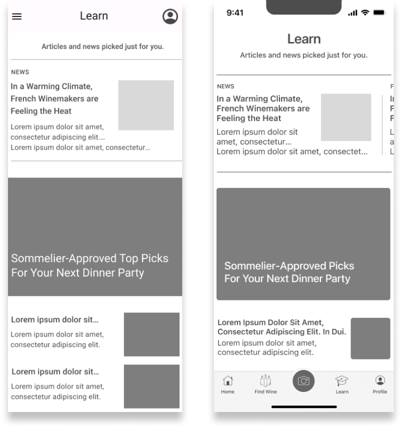
Finally, a separate “Learn” section offers learning materials and curated content, which helps set Wine Match apart from the competition.
Native Designs
I then developed mid-fidelity wireframes and began incorporating different native design patterns for iOS and Android. The designs included some stylistic differences, but the most dramatic distinction was collapsing the tab navigation in the iOS app into a side drawer navigation in Android. While the visibility of the navigation system was better in the iOS tab format, the hamburger menu in Android allowed for the addition of more navigation items to speed up particular user flows, which will be especially useful as new features are added.
The camera button remained onscreen on Android as a floating action button, allowing users to access this function as soon as they open the app when they want to scan a bottle, such as when a waiter is holding up the bottle for them, for instance.
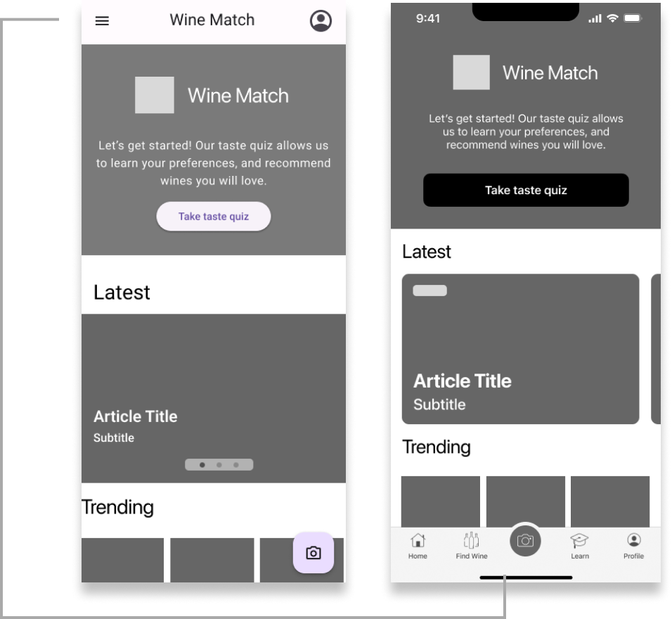
Navigation pattern changes: tab vs. side drawer.
Stylistic changes: Full bleed photos
Developing the Design
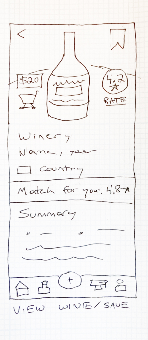
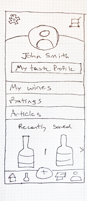
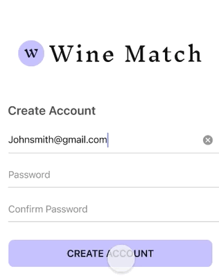
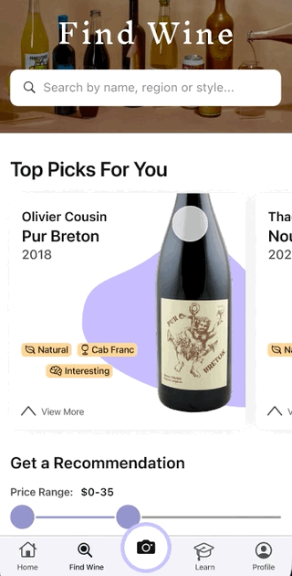
I began to finalize the screen design to make the app feel light, accessible, and straightforward. One feature I wanted to offer users was to give them a personalized score for a wine based on their tastes and also allow them to see the average rating from other users. I initially placed these two metrics on the screen with equal hierarchy, but the layout was unintuitive. I eventually decided to emphasize the personalized rating since this is one of the app's primary functions. The user rating metric is still visible above the fold but became a smaller item located lower down on the screen.
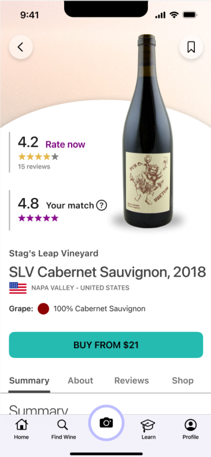
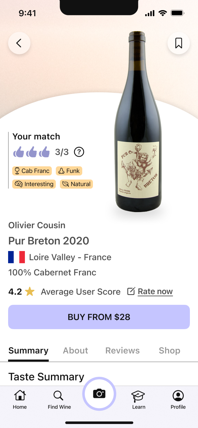
I decided to further differentiate these two metrics by creating two rating systems: 0-3 thumbs up for the "match score" and a more conventional 5-star rating system for the "user score." The "match score" also utilizes the extra space to explain why a wine is a good match through information tags.
Animation / Interaction Design
When building the final prototype, I created animations for several micro-interactions throughout the app.
The transition from the login screen to the homepage displays a subtle logo animation. This movement provides a small moment of delight and highlights successful entry into the app. This interaction got many positive responses in user testing.
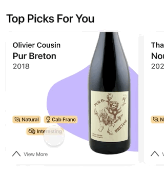
Wine cards allow users to expand the detailed description and access more information quickly without leaving the search screen.
The quiz section uses animated breadcrumbs to inform users of their progress through the questions. Tapping on the selectable buttons provides satisfying feedback highlighting a state change.
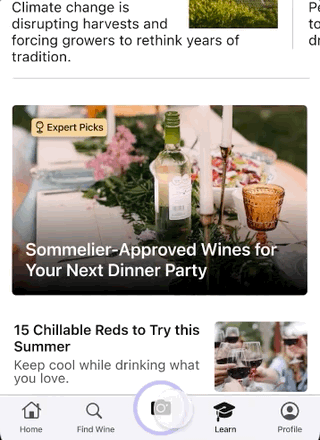
Many subtle transitions help orient users when switching between screens with common elements. The camera button moves and changes color, so it is easy to locate when changing screens.
The search bar screen also uses animation to redirect focus and highlight scren changes.
Final Prototype
With the screens finalized, I used an interactive prototype to complete user testing and collect feedback. This technique gave me valuable insights into what was working on the app and what could be improved. Testers found that some of the screens still felt cluttered and dense, and I used this feedback to add white space to some screens, especially the "Learn" page. Feedback also highlighted some usability issues, such as the readability of text or spacing of icons.
An interactive prototype of the final iOS design is accessible below.

Final Designs / Project Takeaways
The final designs and prototypes for Wine Match show how users can use this app in several ways to identify new wines they enjoy and boost their knowledge and confidence when discussing wine.
Future improvements I would be interested in exploring include using a unique typeface for the brand. In this MVP product, I adhered to the design brief and stuck closely to Material's and Apple's design guidelines, primarily using their native typefaces.
Additionally, the addition of cellar-tracker tools in a future iteration and location-based event suggestions could enrich the product's offerings.
