Case Study | Event Render
Redesigning a 3D Scene-Builder Software Interface
Project Overview
I redesigned the UI and information architecture of the web application Event Render.
Client
Event Render
Industry
Live Events — Scene Building Software
Year
Oct 2021 - Feb 2022
Role
Lead Product Designer
About the Project
Summary
A tool to create 3D renderings of live events.
Event Render is a web-based 3D scene-building tool used by live event professionals to design and visualize stage layouts, lighting setups, and venue configurations. Users can build scenes by placing objects, adjusting lighting, and rendering photorealistic previews of their event spaces.
The Problem
A high learning curve
Research and user interviews indicate that Event Render's unique service is valuable to users. However, the development process up to this point had focused on adding features, and usability had taken a back seat. As a result, the software had a high learning curve and required in-person tutorials and in-depth video walkthroughs to understand how to use it.
Phase 1:
Evaluation
Usability Analysis
I began by assessing the current state of the user interface of Event Render. It was clear from the outset that employing usability principles and Gestalt laws of grouping could significantly improve how intuitive the app was.
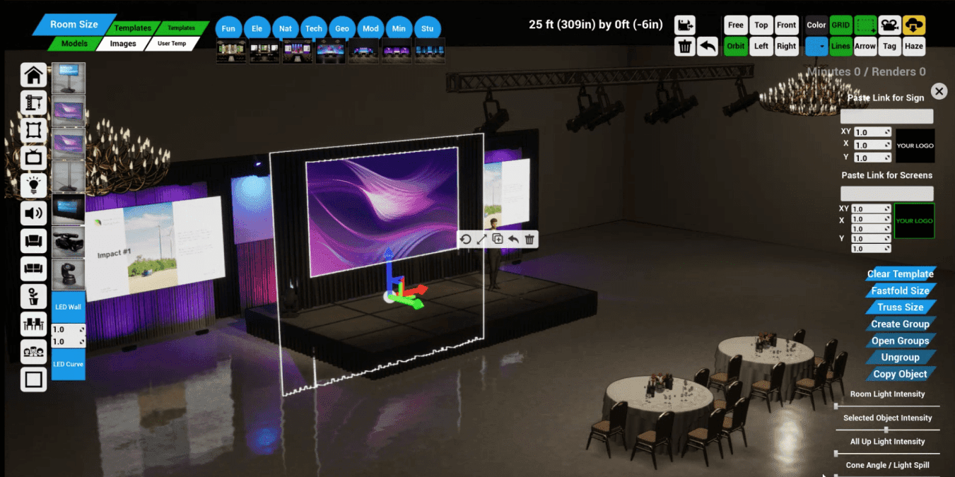
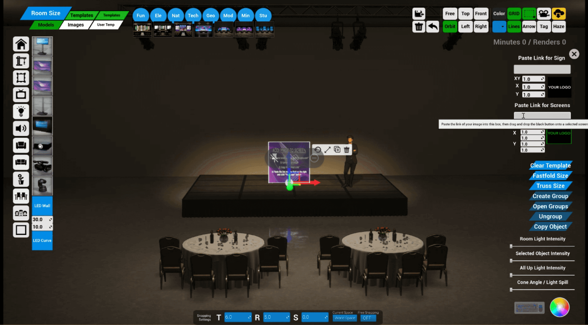
The existing UI of Event Render (above) suffered from a number of usability issues, lack of consistency, and visual clutter.
Some initial areas I identified for improvment:
Tools Menu
The tools menu (upper-right) was a key area for improvement, as it showed all tools next to each-other without separation by group or function. Furthermore, buttons used "system" or "insider" language, which made their operations challenging to decipher. Lastly, the inconsistent use of icons, font size, and color increased cognitive load and visual clutter.
Context-Sensitive Controls
I saw another clear opportunity for improvement with what I came to call "selection controls" (right screen edge). These functions would appear once a user had selected an object in their scene, allowing them to toggle between sizes, group items, change the color, etc. But as it stood all controls would appear when ANY object was selected, regardless of whether they applied to the current selection. Making the selection controls sensitive to context would be a massive usability improvement since users could immediately see and understand the relevant tools available to their current selection.
Accessibility
Some images and text were too small to be able to see or read clearly. Ensuring these were an accessible size would be an essential consideration during the redesign. This presented a challenge because the app was rendered at a fixed resolution on the server and then streamed to the user's computer. I decided to ensure components were easily viewable at 15" screen size and up, based on data from current users.
Phase 2:
Structural Planning
Information Architecture & Navigation
I began to rethink all the menus to incorporate more navigation structure and grouping principles. I conducted a card-sorting exercise to evaluate how to group different tools. I used this as a starting point for conversations with the team, where we began redefining the platform's navigation structure. We arrived at 5 distinct navigation groups.
We sorted the tools menu into a tab navigation format, which made the scope of available options much more apparent, as well as where to find them. Similarly, for selection controls, we decided which tools should be available for each kind of item that a user selects. For instance, if a user selects a truss, the "size" button appears to cycle through preset lengths. If multiple items are selected, the "group items" button appears, and so on.
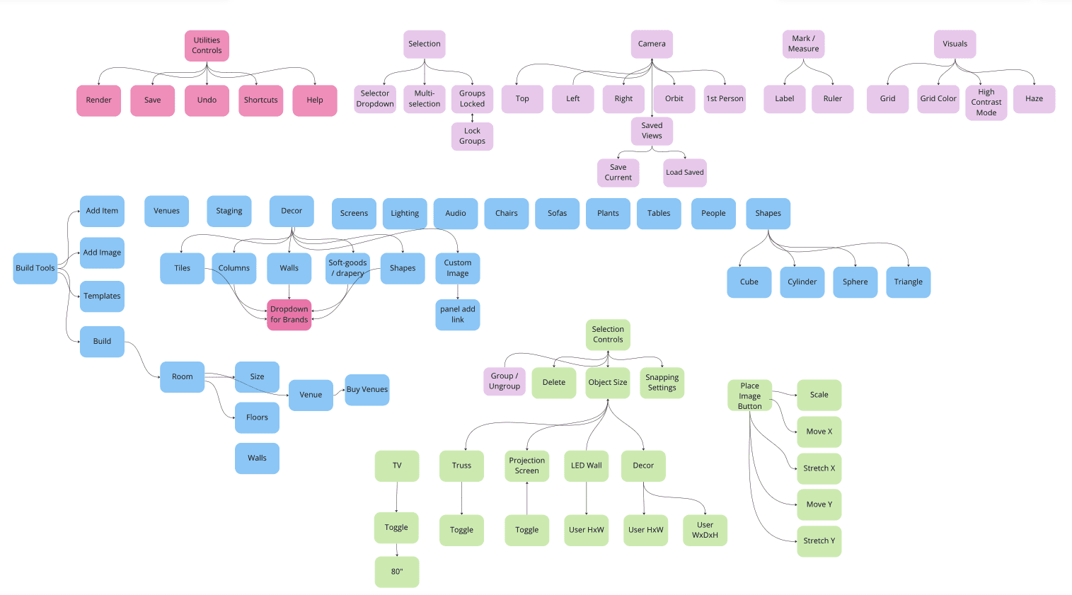
The findings from the card sorting exercise were sythesized into a user flow diagram, which guided the rest of the design process.
Phase 3:
Drawing Inspiration
Design Pattern Research
I looked at design patterns used in various other room-builder software to draw inspiration and ensure that the format would feel familiar to new users of Event Render. We took a page out of the UI design of several video games and decided to explore putting the addable objects at the bottom of the screen instead of on the left edge. Doing this would leave more horizontal space clear, which research has shown was more valuable than vertical space when using the software.
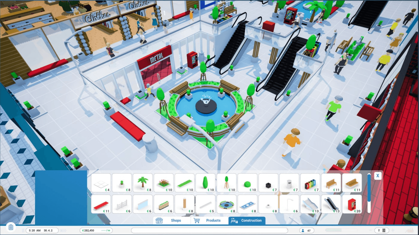
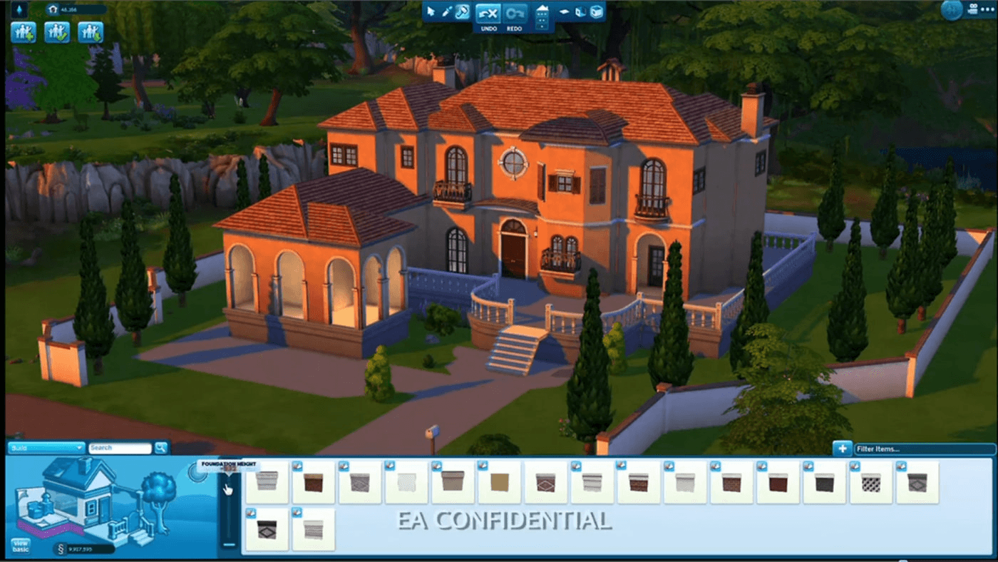
UI pattern examples from scene-building games were used in research the phase.
Phase 4:
Design Iteration
Rapid Prototyping
I then led a design sprint with the team, where we quickly mocked up various layouts for the new user interface. I completed this in medium-fidelity since it was essential to convey to stakeholders that the new designs would improve the current design format. We discussed what was working and not working and refined these options into a shortlist, which were then dot-voted.
Before and After
Final Designs
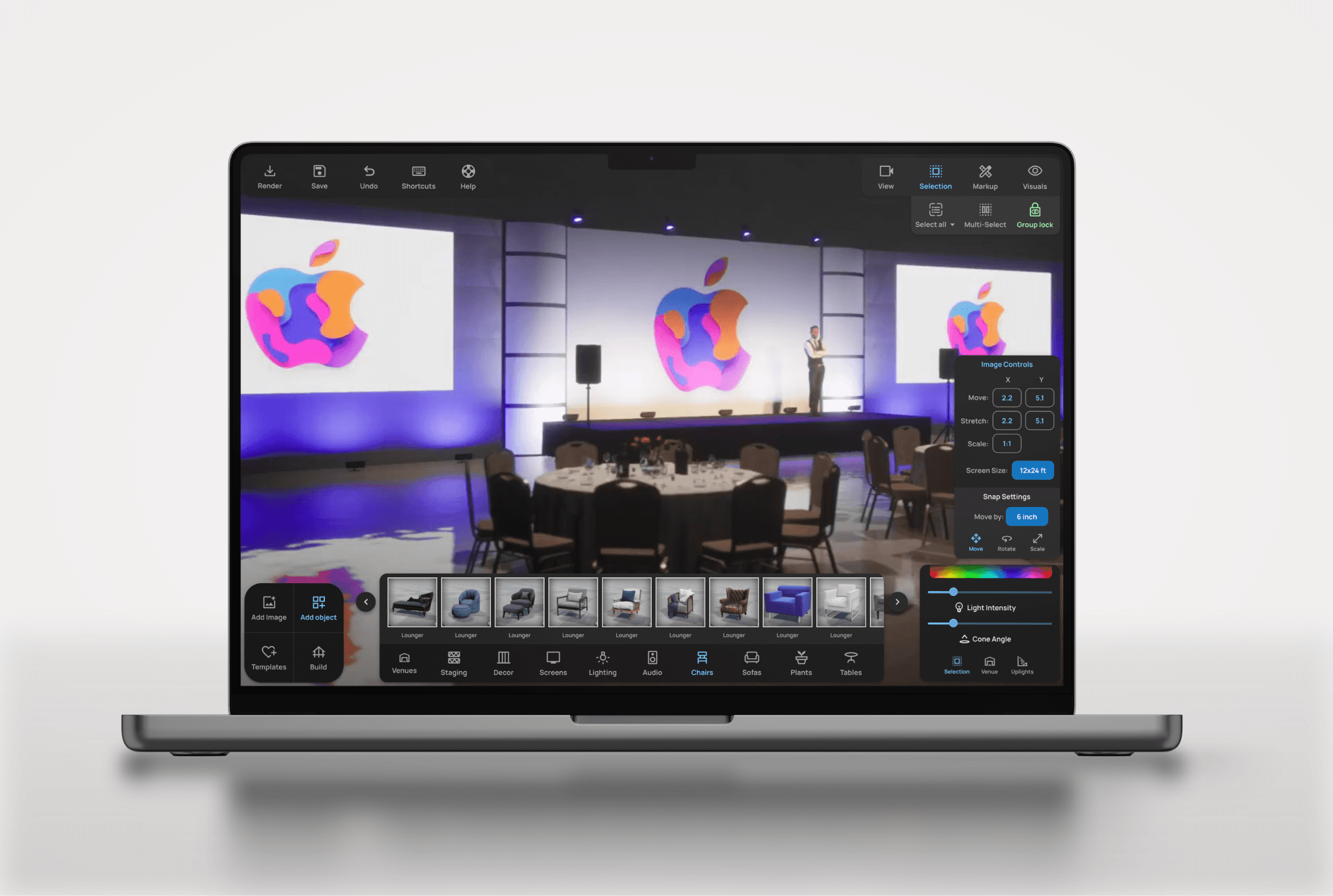
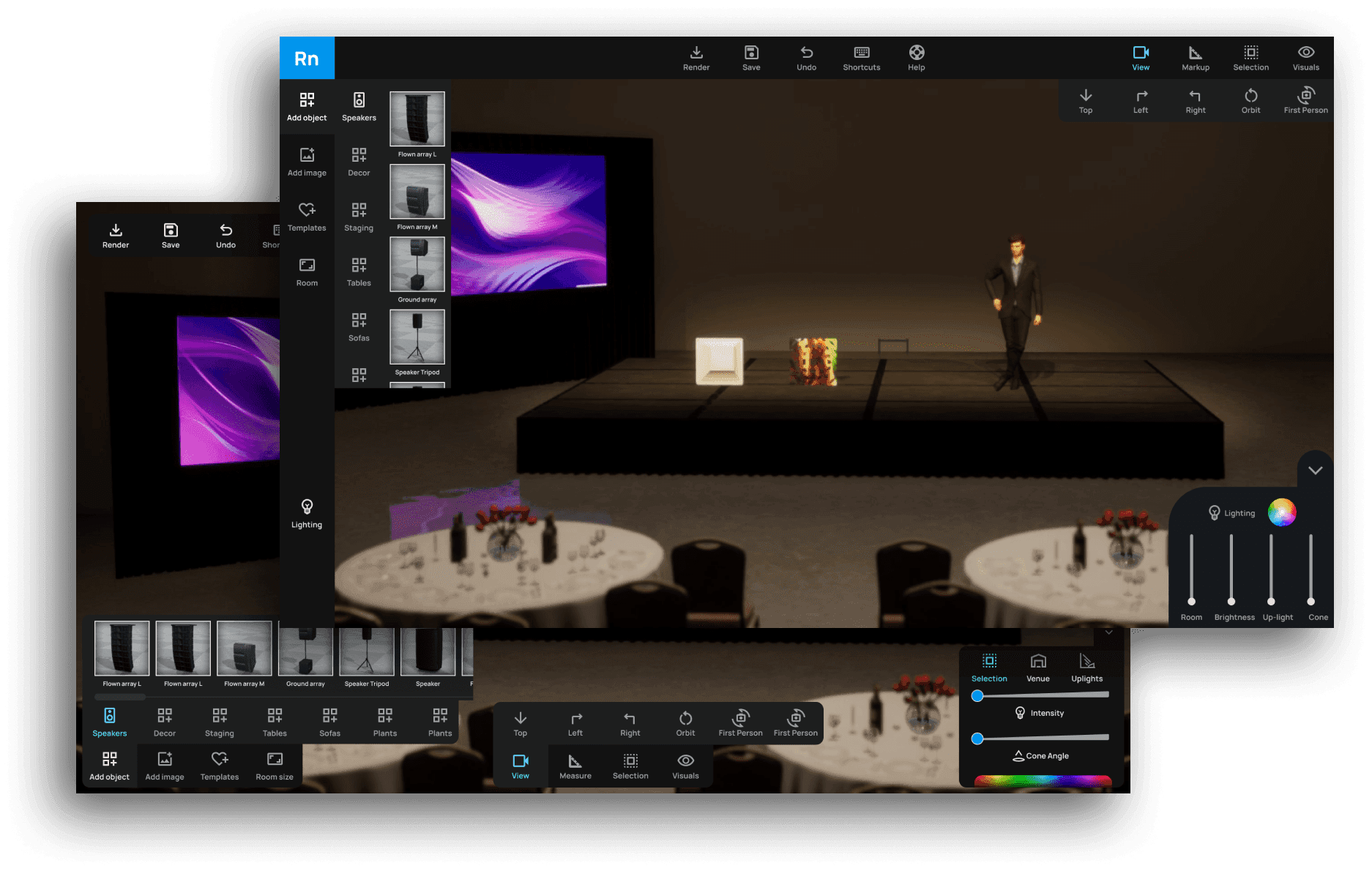
The final designs for a new iteration of Event Render incorporated findings from the usability analysis, card sorting, prototyping, and user testing. I grouped tools and menus onto separate panels to indicate their different functionalities. We decided to implement floating, minimal panels that would obscure the viewable area of the scene as little as possible. I also created the UI in dark mode to avoid drawing focus too much from the scene.
BEFORE
The old design of Event Render. Tools and menus are not sorted or grouped logically. Features lack discoverability and learning curve is high for new users.
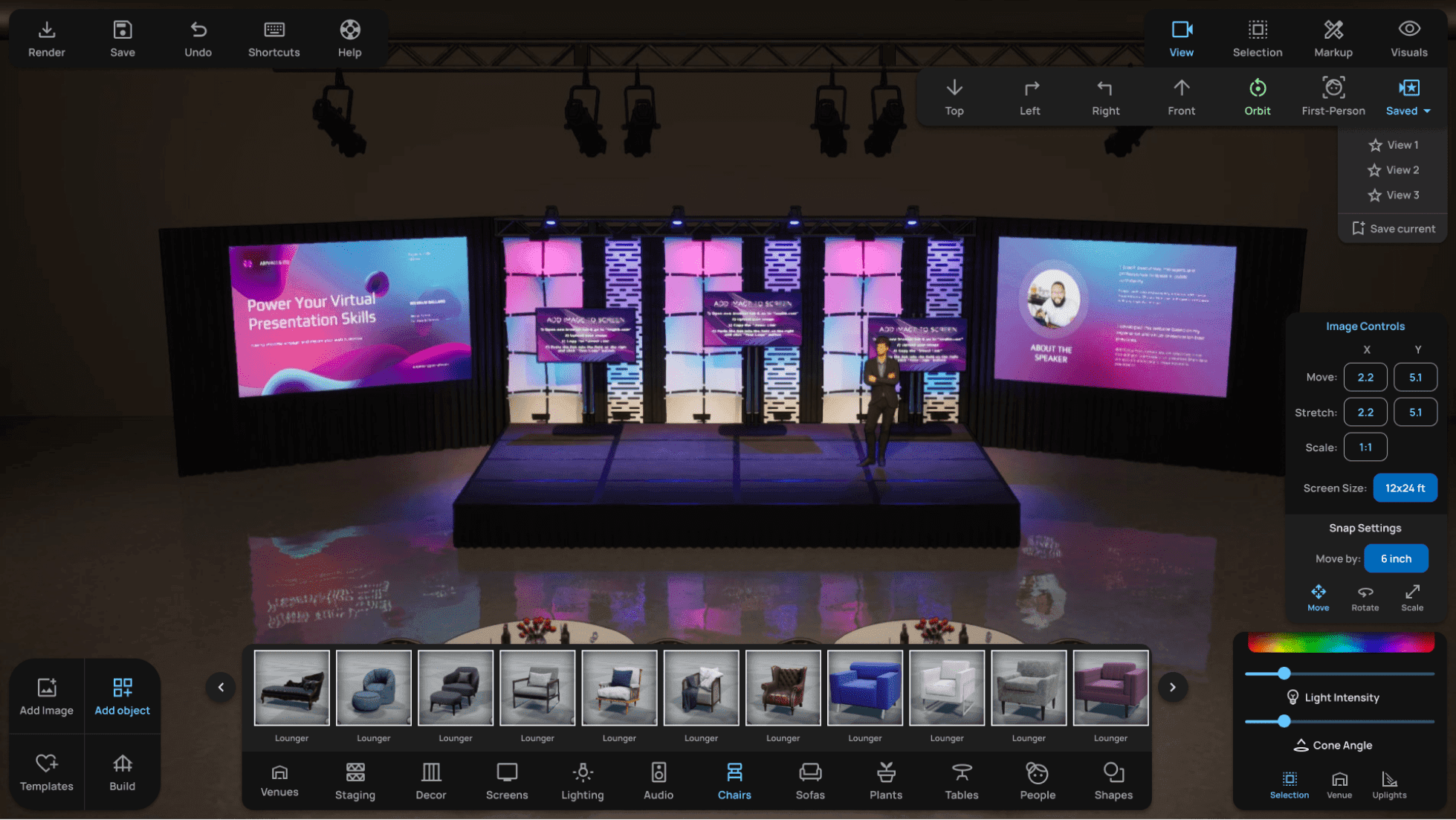
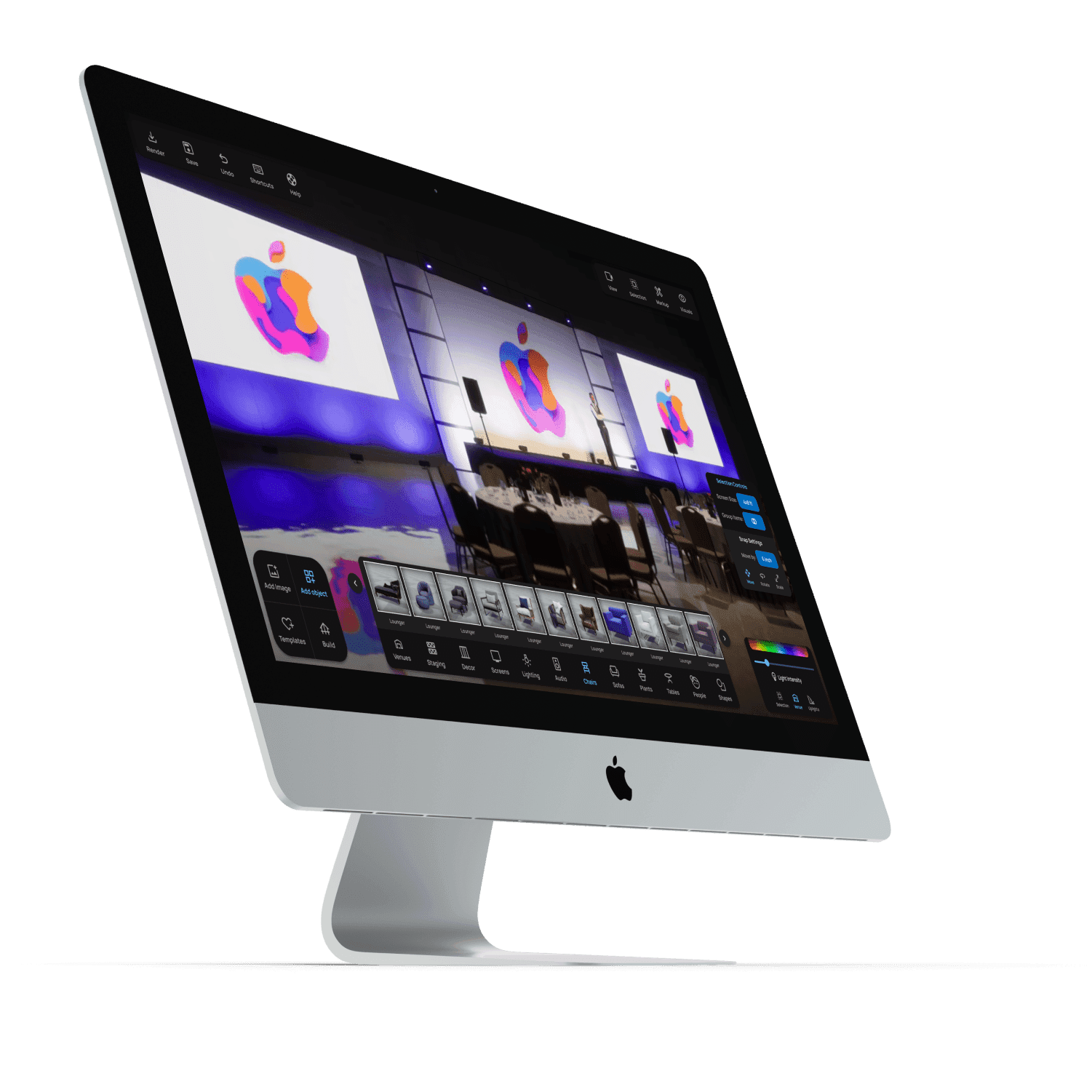
AFTER
The redesigned interface clearly sorts and labels tools by function. Contextual menus greatly reduce clutter.
Individual Menus Before & After Redesign
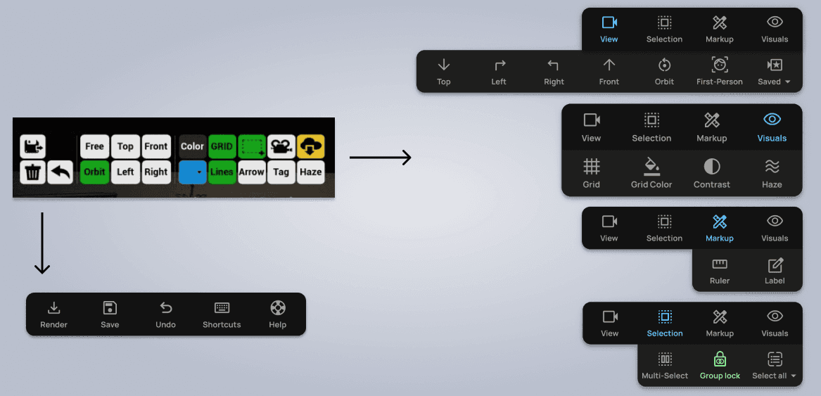
Tools and Utilities Panel
The tools panel was sorted into dropdown menus to make them more intuitive and understandable. While colors had been used loosely before, now blue indicates an active navigation level, while green indicates a toggle tool that is currently active.
Utilities were sorted into a separate panel to be located in the upper left of the screen.
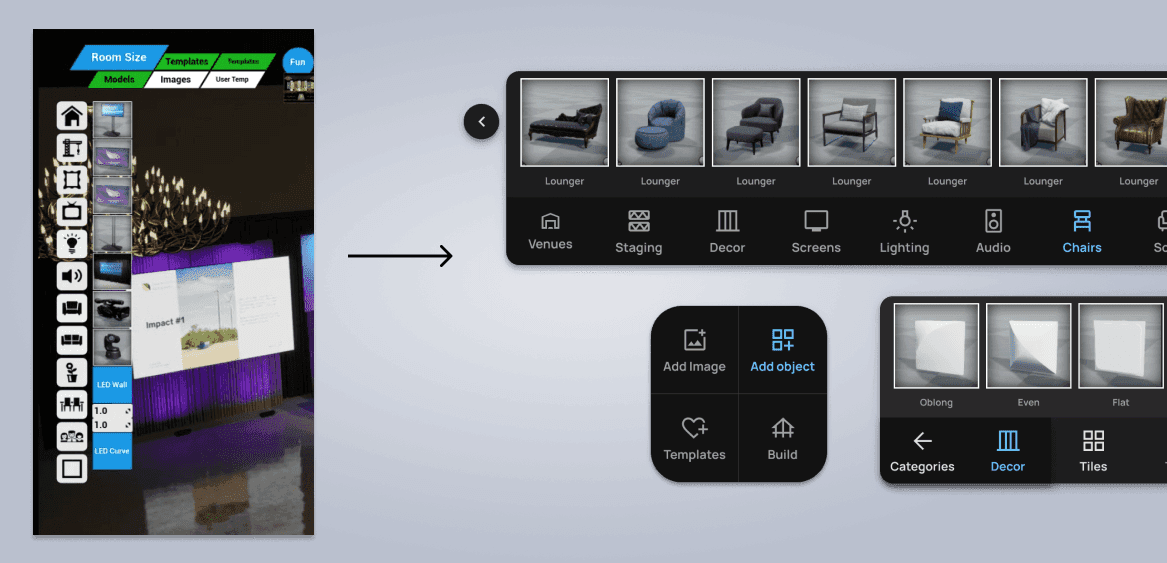
Object Controls: Before and After
I relocated the object controls pictured here to the bottom of the screen, which allowed for larger thumbnails without interfering with screen space.
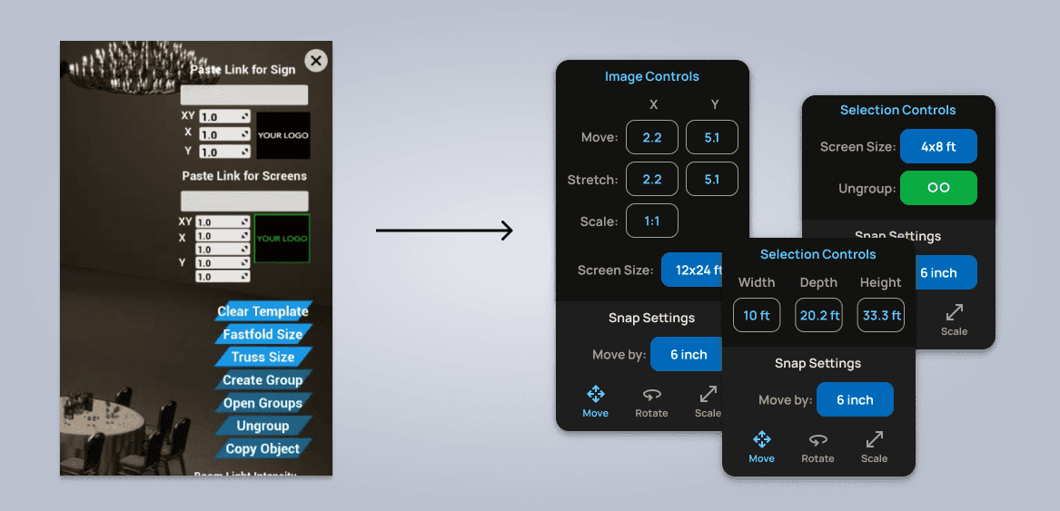
Selection Controls
Selection controls become context sensitive, and only display relevant tools and controls within a dedicated panel.
Documenting the Design
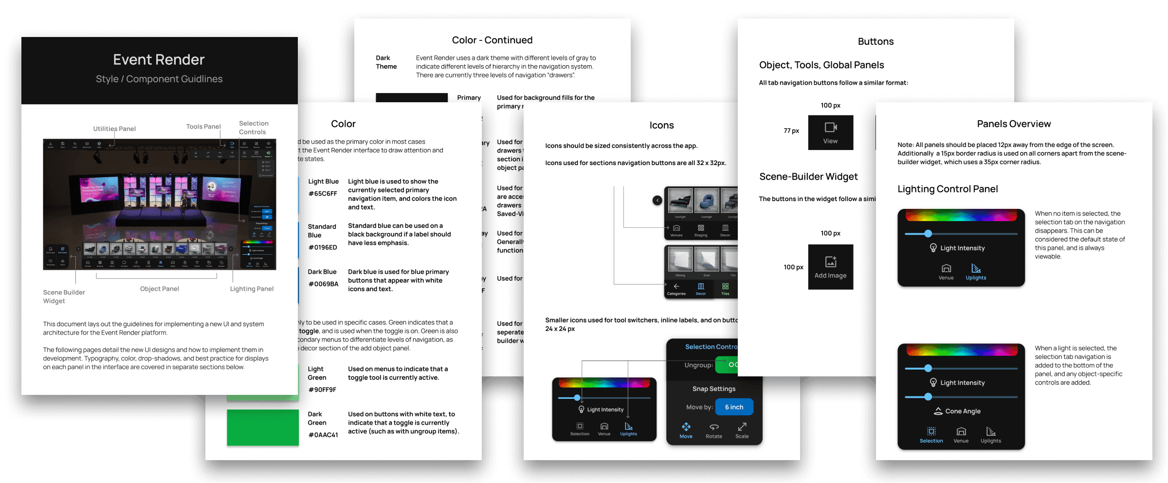
Style Guidelines
I created a comprehensive style guidelines document for the development team. In addition to implementing icons, color, typography, and shadows, I detailed best practices for all menus and how and when to use different variants.
Project Takeaways
Redesigning Event Render taught me that complex tool interfaces fail not because they have too many features, but because they lack organizational logic. The original UI showed every tool simultaneously regardless of context — the equivalent of opening every drawer in a kitchen at once. The biggest wins came from two principles: grouping tools by function through card sorting, and making controls context-sensitive so users only see what's relevant to their current selection. This project also reinforced the value of studying adjacent domains — drawing inspiration from video game UI patterns for the bottom-mounted build menu was a breakthrough that freed up valuable horizontal screen space.