Case Study | National University Website
National University Program Pages
Project Overview
I led the design or redesign of a number of projects for National University through my role as a product designer for the digital agency Brick Factory. A major project was the redesign of the program pages that house information about their degrees.
Client
National University
Agency
Brick Factory
Industry
Nonprofit / Education
Year
2023-2024
Role
Lead Product Designer
About the Project
Summary
Redesign the degree information landing pages.
Redesign the program landing pages that serve as the primary conversion funnel for prospective students exploring National University's degree offerings. These pages needed to more effectively communicate program details, career outcomes, and tuition information — while improving request-for-information and application start rates.
The Problem
The page layout could make it difficult to obtain important information.
The existing program pages were underperforming on conversion metrics. National University had extensive analytics showing where prospective students were dropping off, and early stakeholder reviews identified the course details section as a particular pain point. The broader challenge was that important information — tuition, start dates, career outcomes, degree requirements — was either buried in dense paragraph text, scattered across disconnected sections, or missing entirely.
Phase 1:
Rethinking Page Content
Looking for Areas of Improvement in Existing Designs
I began the process by identifying points in the current program pages that felt confusing, redundant, or had a UI that impeded easy access of information.
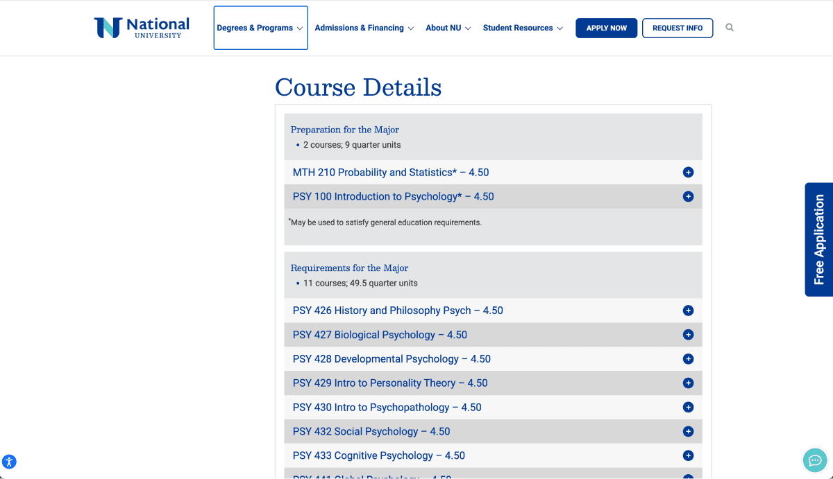
The existing course details section was difficult to scan for information, and to interact with.
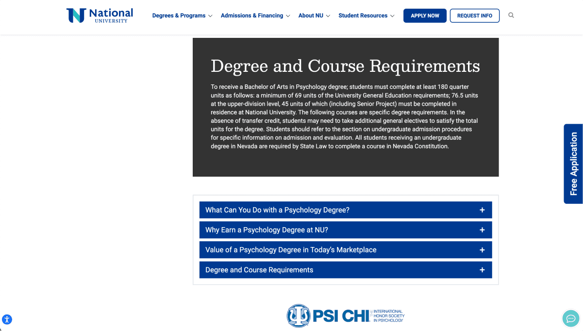
A section about degree and course requirements was disconnected further down the page, and the block paragraph text was not formatted to be easily readable.
Redesigned Course Details Section
I decided to combine these two sections, as well as rewrite and reformat the text to make it more easily understandable. For the actual course description content, I added new section headers that made it clear which stage of learning different courses fell under. I also used a two column pattern, color, and typographic hierarchy to create a system which was easily scannable while containing all the same information.
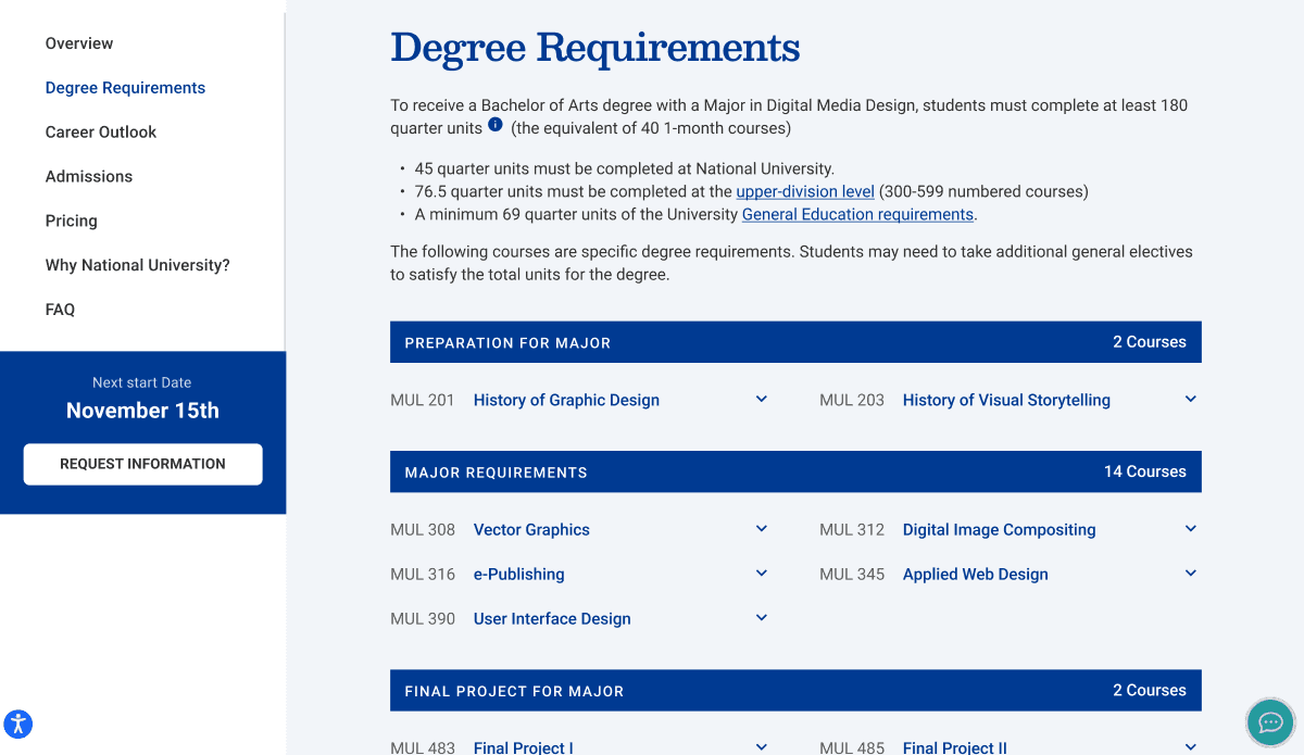
My redesigned course details section (now just called "degree requirements") sought to improve high level understanding and be more easily digestible. A sticky panel on the left further improved in-page navigation and featured a clear CTA.
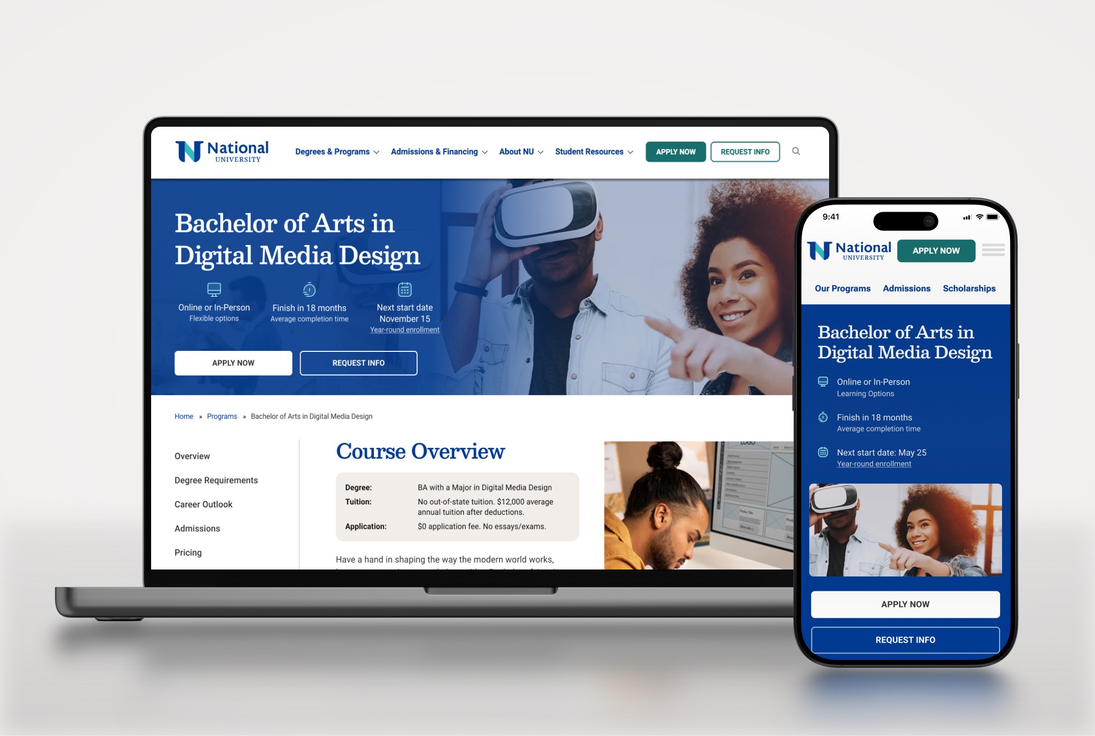
Hero Redesign
Rethinking Hero Content
I identified the hero section as another key area for improvement. There was a confusing mismatch of text hierarchy in the hero, and some missed opportunities to highlight key value props that National University offers in their degrees. Additionally, important information like start dates and tuition were difficult to locate.
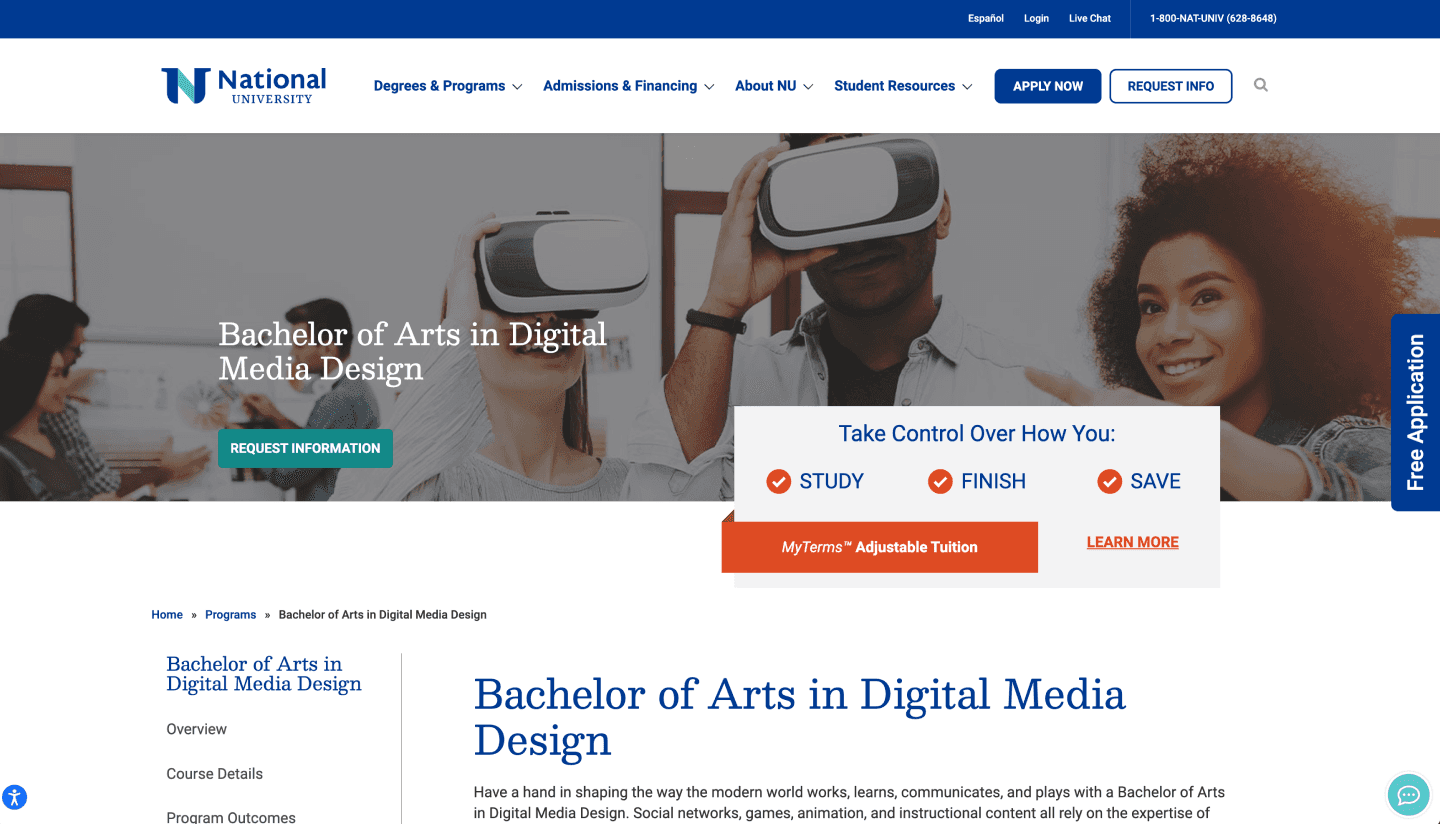
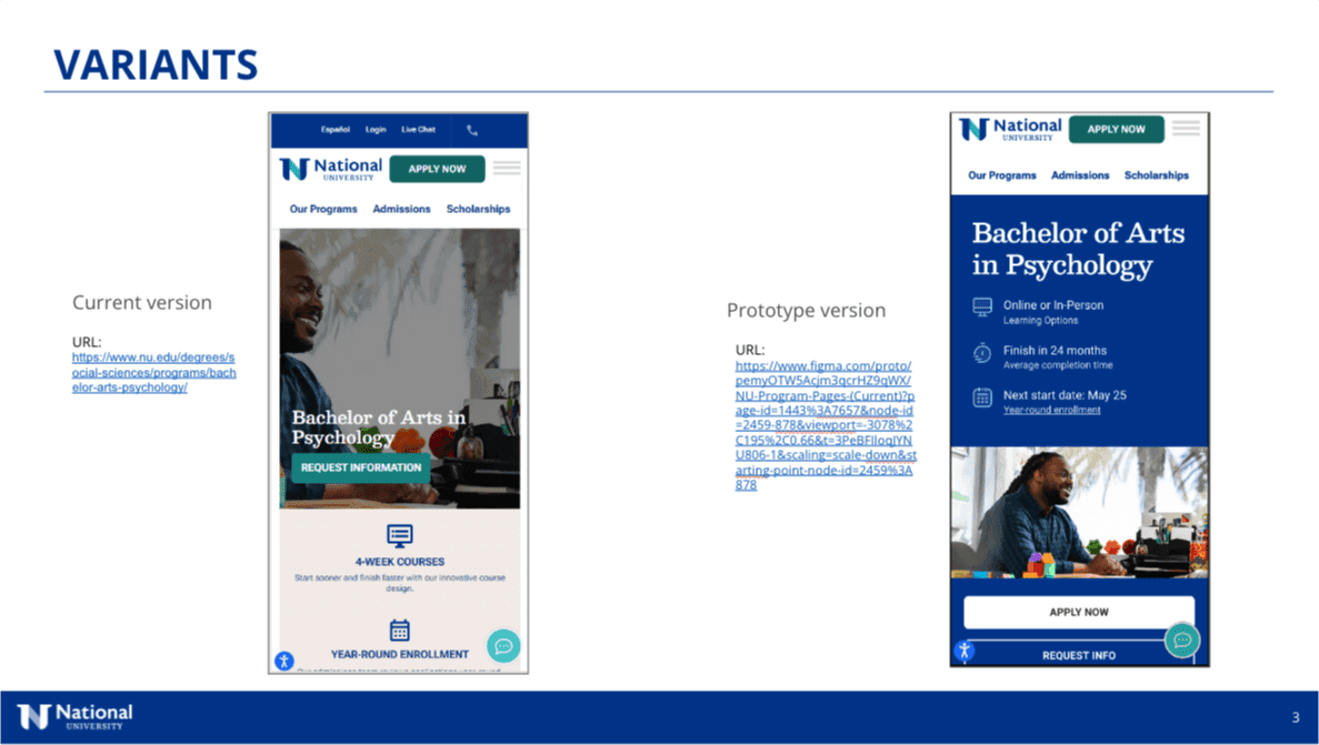
The existing program page hero section.
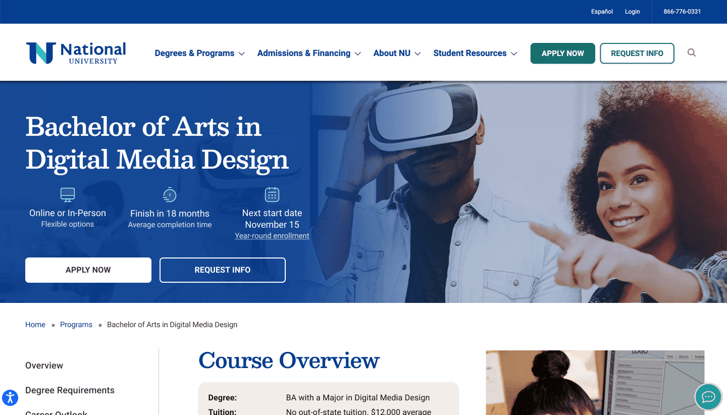
The redesigned hero section features clearer hierarchy, value propositions, better CTA's, and a quick-facts section that gives important info at the top of the page.
Phase 2:
Validating Design Decisions
Incorporating User Testing
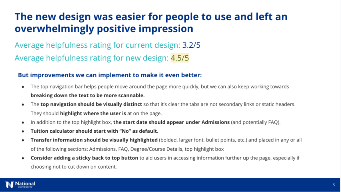
With the core redesigns taking shape, I worked with our research team to validate key design decisions through structured user testing — comparing the new designs directly against the existing pages. The results supported my design decisions:
41% increase in helpfulness
Helpfulness rating improved from 3.2/5 to 4.5/5
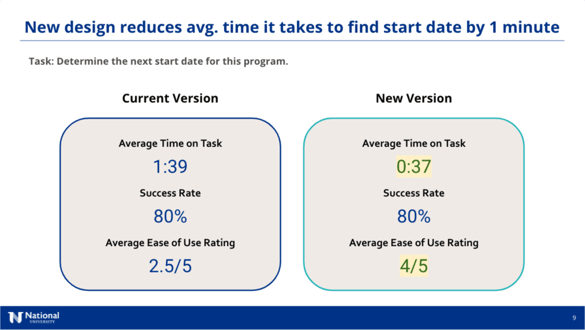
2.5x faster to find important information
Average time to find program start date dropped from 1:39 to 0:37.
60% easier to use
Ease of use rating rose from 2.5/5 to 4/5
Testing also surfaced specific improvements that were incorporated into the next round of edits, including making the sticky navigation more visually distinct, surfacing start dates in additional locations, and improving the tuition calculator's default state.
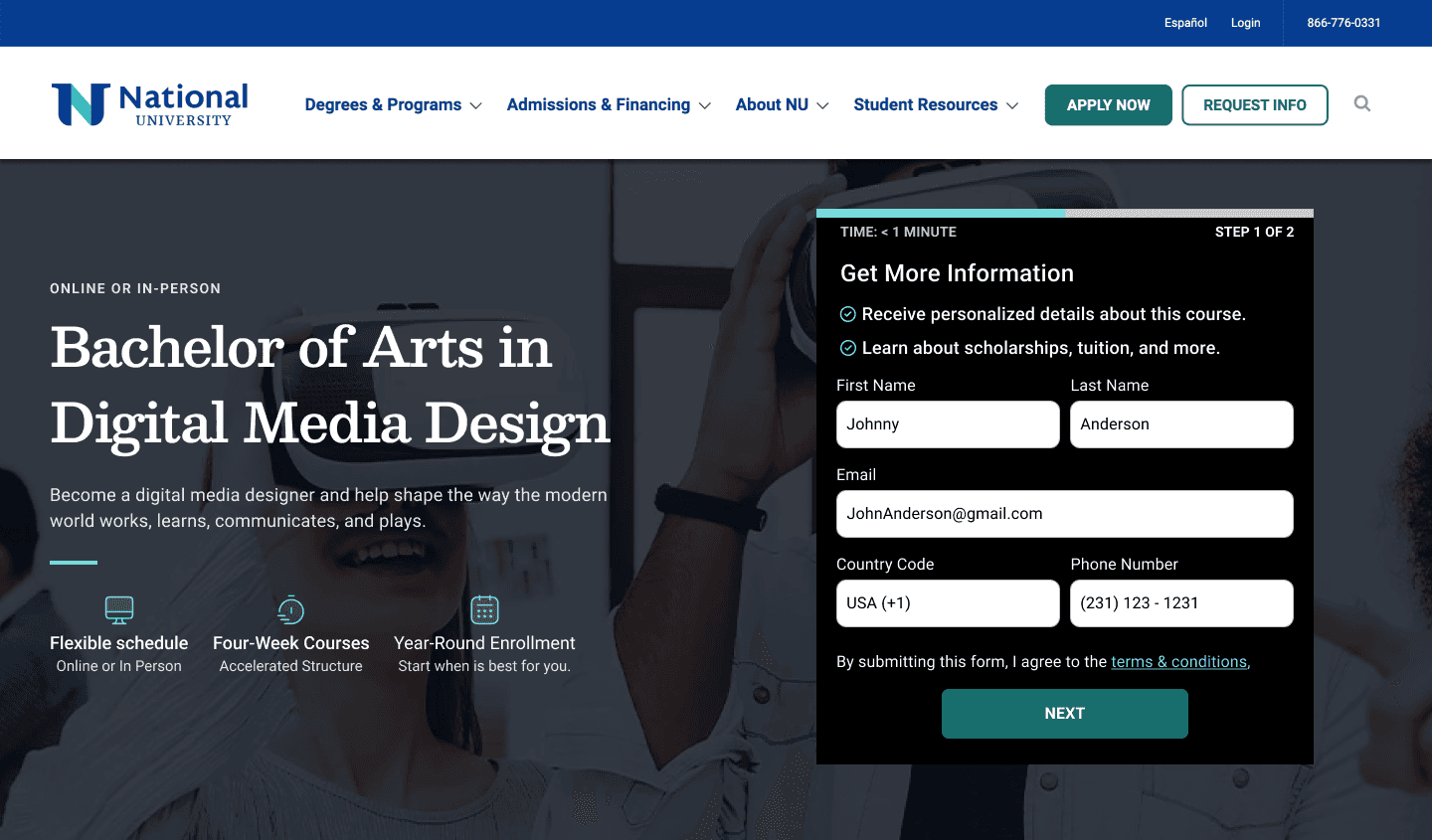
In earlier iterations of the program page we explored using a form incorporated into the hero section in an attempt to improve conversions. Ultimately this direction was discarded due to lower ratings in user preference studies.
User testing studies were run comparing the current version of the pages to the new designs.
Research credit: Danielle Anthony
User testing reports were created throughout the process
Phase 3:
Additional Content
New Section and Features
Beyond improving existing content, I identified opportunities to add new functionality that would help prospective students make more informed decisions.
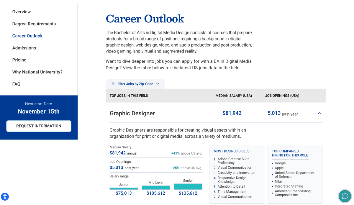
The new "Career Outlook" section grew out of a desire to give prospective students better data about the careers they could move into with their degree. This feature incorporated data pulled from Lightcast's API.
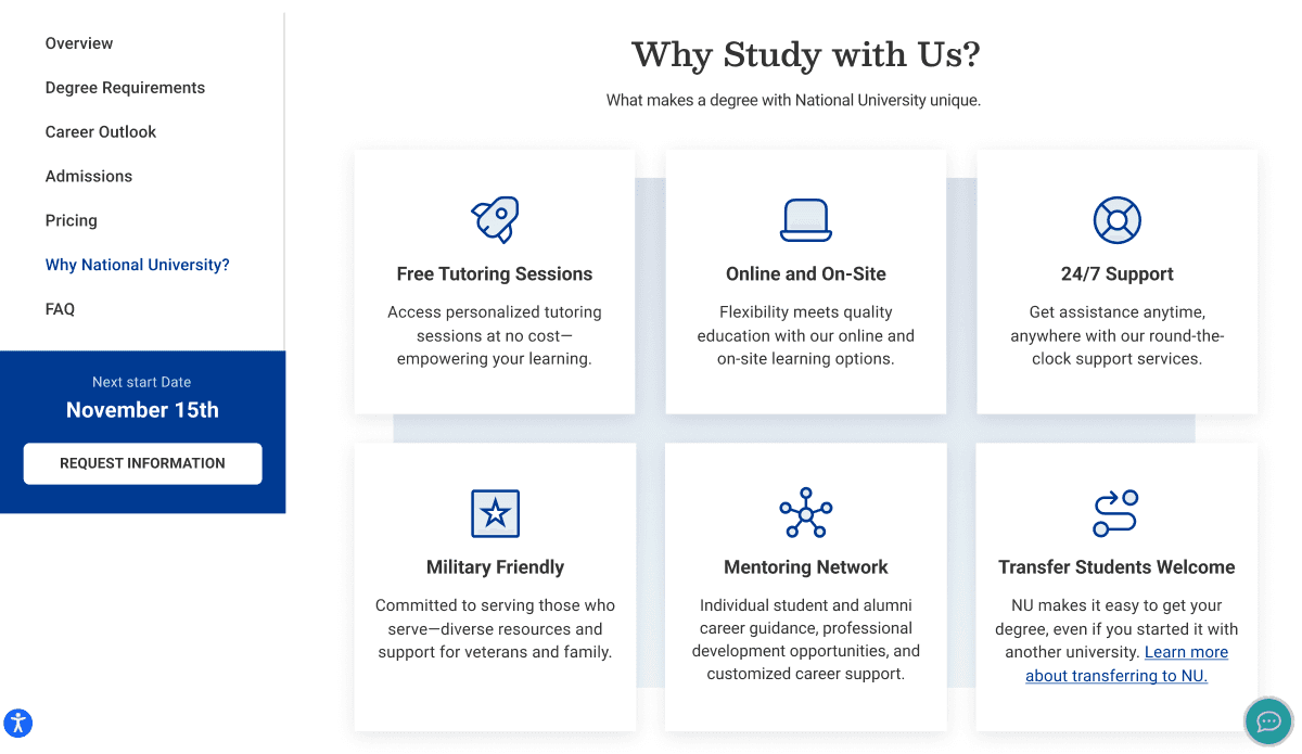
The 'why study with us' section sought to portray key value propositions in a more organized and central way. Much of this information had been scattered amongst different sections or hidden in paragraphs.
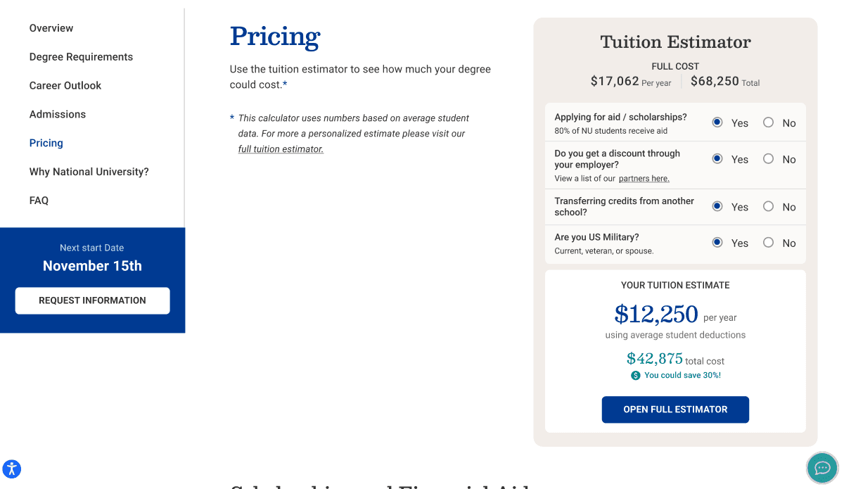
The tuition estimator widget was created as a small on-page variant of the full tuition estimator that National University has to estimated tuition reductions (a separate design project I led a redesign of). This short version sought to give users a quick estimate based on some brief yes/no questions.
Project Takeaways
Redesigning National University's program pages reinforced that conversion optimization on content-heavy pages is largely an information architecture problem. The existing pages had most of the right content — it was just poorly organized, buried in block paragraphs, or disconnected from related information. The course details redesign was a clear example: combining two separated sections, reformatting dense text into scannable columns, and adding sticky navigation transformed usability without adding any new content. User testing validated these decisions quantitatively, but also surfaced assumptions I'd gotten wrong — like the hero-embedded form that seemed like an obvious conversion win but tested poorly against a cleaner layout. That kind of humility toward testing data, even when it contradicts your instincts, is something I carry into every project.