Night & Day Tracker | iOS App
Designing A Sleep & Fitness Tracker for Apple Watch

Project Overview
I designed and built Night & Day, a sleep and fitness tracking app for iPhone and Apple Watch. The app combines advanced sleep science with activity tracking to give users a clear, unified picture of their rest and performance — without the subscription fees or cluttered interfaces common in the space.
Client
Personal Product
Industry
Health & Fitness
Year
2025–2026
Role
Product Designer (& Developer)
Platform
iOS / Apple Watch
About the Project
Summary
A science-based sleep and fitness tracker, designed to fill a real gap in the Apple Watch ecosystem.
As an Apple Watch user, I was frustrated by the fragmented landscape of health tracking apps. The watch collects rich health data — sleep stages, heart rate variability, resting heart rate, workout metrics — but no single app synthesized it all into something clear and actionable. I wanted an app that combined the sleep scoring depth of Oura, the sleep debt concept from Rise, and the weekly activity goals from Fitbit's Zone Minutes — all in one place, with a clean interface and no recurring fees.
After evaluating the competitive landscape and finding nothing that checked all the boxes, I decided to design and build it myself.
The Problem
Existing apps each solved a piece of the puzzle, but none solved it all.
The Apple Watch health app ecosystem is crowded but surprisingly incomplete. Most apps focus on one dimension of health tracking and do it well, but force users to cobble together multiple tools — or compromise.
I identified four capabilities I wanted in a single app: sleep scoring with actionable insights, sleep debt tracking against a personalized goal, a daily readiness score combining sleep and recovery data, and weekly activity tracking based on WHO exercise guidelines. No existing app offered all four in one cohesive experience.
Competitive Landscape
Evaluating the Competition
I evaluated the most popular sleep and activity tracking options available to Apple Watch users, looking at how each handled the four capabilities I was after.

AutoSleep
The most frequently recommended "one-time purchase" sleep tracker. Powerful under the hood, but the interface is notoriously dense and unintuitive. It offers a form of sleep debt tracking, but the logic is flawed — users can go into "sleep credit," which doesn't align with how sleep science actually works.

Sleep++
A popular option in the free tier. Suffered from heavy and dense UI while lacking easily actionable insights. Also missing was sleep debt tracking. Their readiness scoring logic was overly harsh and resulted in scores of "0".

Rise
Clean, focused app that does sleep debt tracking well, with a customizable sleep goal. However, it's essentially a single-feature app behind a monthly subscription — a hard sell for a limited feature set.

Oura
Beautiful UI, excellent sleep and readiness insights. But requires a $300+ ring plus a subscription, its sleep debt implementation isn't customizable or prominently featured, and it doesn't track weekly activity in the way I was looking for.

Pillow
A decent sleep tracker with some nice visualizations, but limited in scope. No readiness scoring, no meaningful activity integration.

Apple Health / Fitness
While I had already started working on this app, Apple began rolling out its own native sleep scoring logic. Clearly they had identified the same gap in offerings that I had.
However feedback online aligned with my own experience: the Apple algorithm is overly generous. Even after a terrible night users were waking up with excellent scores. This validated another goal of my app: create a rating system which is strong enough to be useful, while remaining fair and encouraging.
Additionally, Apple's activity ring-based system requires users to hit the same activity target every single day — an approach with no basis in exercise science guidelines, which recommend weekly rather than daily targets.
The gap
A unified sleep and activity tracker combining the best ideas from across the ecosystem — Oura-quality insights, Rise-style sleep debt, Fitbit-inspired weekly activity goals — grounded in sleep and exercise science rather than arbitrary metrics, without a subscription, and optimized for Apple Watch.
Phase 1:
Defining the Core Experience
Four Metrics That Matter
Before opening any design tools, I defined the core metrics the app would center around. A guiding principle throughout this project was that every metric should be rooted in peer-reviewed sleep and exercise science — not arbitrary targets. Each metric needed to be scientifically defensible while remaining immediately understandable to a non-expert user. This science-first approach became a key differentiator: where most competitors invent their own scoring systems or set arbitrary daily goals, Night & Day's metrics trace back to published research.
Sleep Score
A nightly composite score analyzing duration, efficiency, consistency, sleep stages, and recovery markers. The challenge was making this feel personalized rather than generic — the score needed to reflect your night relative to your baseline, not an arbitrary standard.
Sleep Debt
A running balance of accumulated sleep deficit, tracked against a user-defined sleep goal. Unlike competitors that allow "sleep credit" (which isn't scientifically valid), Night & Day only tracks debt — you can pay it back, but you can't bank sleep. This mirrors the science: sleep debt is arguably the most important long-term health metric the app tracks.
Readiness Score
A daily assessment combining last night's sleep quality, heart rate variability, resting heart rate, sleep debt, and recent activity levels. This tells users whether to push hard or take it easy — the kind of insight previously locked behind Oura's subscription.
Activity Points
A weekly activity metric directly based on the World Health Organization's guideline of 150 minutes of moderate-intensity aerobic activity per week. Every minute of elevated heart rate earns points, with vigorous activity earning double — matching the WHO's finding that vigorous exercise delivers roughly twice the health benefit per minute. Most fitness apps set arbitrary daily goals (Apple's "close your rings" being the most prominent example), but there's no scientific basis for requiring the same activity level every single day. A weekly target reflects how real people exercise: some days are hard, some are rest days, and that's healthy. This reframing was a core design decision.
These four metrics pair into two natural relationships that mirror the app's name. Sleep Score and Readiness Score capture today — how you slept last night and how ready you are right now. Sleep Debt and Activity Points capture the longer arc — your cumulative sleep balance and weekly exercise progress. This pairing gives users both immediate feedback and the bigger picture, which research suggests is important for sustained behavior change.
Phase 2:
Prioritizing Health Insights
Designing Insights, Not Just Data
The most challenging design problem wasn't visual — it was informational. Each morning, the app presents a headline insight about your sleep. But with 10+ underlying metrics, how do you decide what to surface?
My first approach used rigid score bands: if your score was below 70, always show duration. If it was 70–84, show recovery. This quickly proved too prescriptive. I could score a 68 with near-perfect sleep duration but poor HRV recovery — and the app would tell me I didn't sleep long enough. That's not just unhelpful, it's wrong.
The solution was severity-based prioritization. Each metric is evaluated independently against meaningful thresholds (not arbitrary score bands). Duration only gets flagged if you're 40+ minutes short — because being 18 minutes under your target isn't interesting or actionable. Recovery gets surfaced when your HRV or resting heart rate deviate significantly from your personal baseline. The system then ranks issues by their actual impact on the overall score, surfacing the most meaningful insight first.
This created a much more dynamic and trustworthy experience. On a night where you slept long enough but your body's recovery markers were off, the app tells you about recovery. On a night where you simply didn't sleep enough, it tells you that. The insight always matches what actually happened.
Tuning Sensitivity
A related challenge was calibrating how harsh or lenient the scoring should be. Score too harshly and users with chronic sleep issues — shift workers, new parents, people with sleep disorders — will see relentlessly low scores and disengage. Score too leniently and the numbers become meaningless.
I aimed for a system that's honest but not punishing. An "okay" night should feel like useful information, not a failure. The scoring reflects real sleep science while accounting for the fact that not everyone has the luxury of optimizing for 8 perfect hours every night. The personalized sleep goal was an important part of this — sleep research shows individual sleep needs vary significantly, and the app should respect that rather than holding everyone to the same standard. When a user first opens the app, it analyzes their existing sleep history and recommends a personalized sleep target based on their actual patterns. Users can adjust this freely, but starting from a data-informed suggestion rather than a generic "8 hours" sets the right tone: this app is paying attention to you specifically.

The app analyzes existing sleep data to suggest a personalized sleep target, which users can adjust to match their needs. A quick onboarding guides users through this step, which can be revisited in settings.
Phase 3:
Feature development
Features Deep Dives
Each core feature required its own design challenges to get right. Here are three that shaped the final product.
Sleep Debt Tracking
Sleep debt was a core differentiator, but getting the implementation right required careful thought. The concept is simple — your body accumulates a deficit when you sleep less than you need — but the details matter.
Key decisions included: tracking debt over a rolling window rather than indefinitely (your body doesn't "remember" a bad night from six months ago the same way it remembers last week), preventing "credit" accumulation (sleeping 10 hours doesn't mean you've banked 2 hours for tomorrow), and making the debt gauge visible on the home screen alongside the sleep score so users always have context on their longer-term trend.
The debt visualization shows both the current balance and the trajectory — whether it's growing or shrinking — so users can see the impact of their recent habits at a glance.
Automatic Activity Detection
Activity Points track every minute your heart rate is elevated, whether during a logged workout or not. This means the app needs to automatically detect when you're active — even if you're doing yard work, playing with your kids, or on a brisk walk without starting a formal workout session.
This created an interesting technical challenge around Apple Watch's passive heart rate sampling. During a logged workout, the watch samples every few seconds. During normal wear, it samples roughly every 5–10 minutes. My initial detection logic used a 3-minute gap threshold between samples — if there was a gap longer than 3 minutes, the session would end. This caused sessions to terminate abruptly while the user was clearly still active, simply because the next heart rate reading hadn't arrived yet.
The fix was understanding the hardware behavior and designing around it — extending the gap tolerance to 12 minutes to accommodate passive sampling intervals, and adding grace periods for brief dips below the activity threshold so a momentary drop doesn't split one continuous session into fragments.
The Readiness Score Semantic Inversion
One particularly instructive bug revealed how easy it is to create confusing health messaging. The readiness score's activity component is recovery-focused: a low score means you've been very active recently and need rest, while a high score means you're well-recovered and ready for activity.
The insights logic had this inverted — interpreting a low activity score as "you've been sedentary" when it actually meant "you've been pushing hard." After a heavy exercise day, the app was telling users to get moving. Getting the semantics right wasn't just a code fix — it was a design lesson about how counterintuitive health metrics can be, and why every piece of copy needs to be validated against real usage patterns.
The Final Experience
All of that thinking and iteration culminated in the shipped product. Here's a walkthrough of the core experience.


Phase 4:
Shipping and Iterating
From Prototype to Product
The app started as a design experiment — could I use SwiftUI and AI-assisted development tools to bring a product concept to life as a working prototype? It evolved into a fully functional product as each piece came together. The design and code developed in parallel rather than sequentially, which meant I could test real interactions with real data immediately rather than designing in abstraction.
I ran an external TestFlight beta to validate the experience with real users before launch. Tester feedback directly shaped decisions like the notification strategy and the onboarding flow.
iOS Notification Strategy
Notifications were designed as a lightweight engagement layer — a morning readiness summary, alerts when sleep debt crosses certain thresholds, confirmation when activity points are logged, and a weekly goal completion celebration. During testing, one notification type (sleep debt cleared) was producing false positives, so I disabled it for launch rather than shipping something unreliable. This kind of restraint — knowing when to ship less — was an important part of earning user trust early on.
Handling Edge Cases
Real-world health data is messy. One of the first post-launch issues was a crash affecting Oura Ring users who wore their ring inconsistently — the app assumed sleep data would always have ordered, complete date ranges, and sparse data broke that assumption. This crash was a lesson in defensive design: health apps need to gracefully handle the reality that users don't behave consistently, data syncs can fail, and sensors don't always provide clean information.
Launch Strategy
The app launched as a free download with no subscription — deliberately positioning against the trend of health apps charging monthly fees for basic insights. The strategy was to validate market interest and build a user base first, with potential monetization paths explored later based on which features users actually value.

Settings allowed power users to customize their activity points thresholds to increase/decrease the sensitivity to their liking or health level. Notifications are also fully customizable.

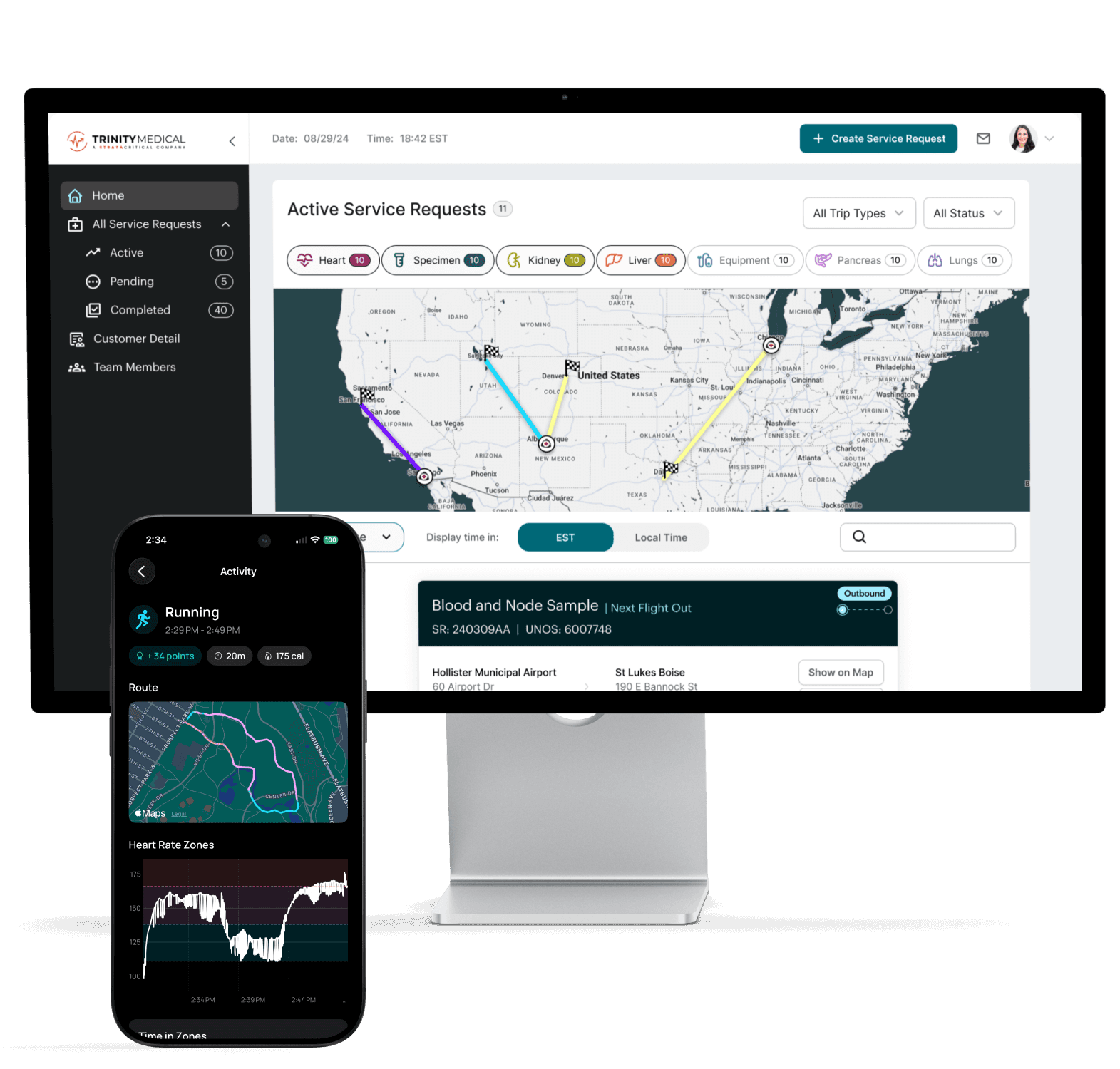
A selection of product photography I created for promotion in the Apple App Store.
Results
Current Outcomes
The app launched in early January 2026. Here's how it's performing.
5-star rating
The app is live on the App Store and currently holds a 5-star rating.
21% conversion rate
App Store page views convert to downloads at a 21% average — suggesting the value proposition and App Store presentation effectively communicate what makes the app different.
25% user retention
Roughly 25% of users remain active after 3 months — a strong signal for a v1 product with no marketing spend, indicating that the daily insights provide enough ongoing value to sustain a habit.
Project Takeaways
Designing Night & Day reinforced that health apps live or die on the quality of their insights, not their data. Any app can display a number — the hard part is making that number meaningful, trustworthy, and actionable without being prescriptive or discouraging.
The biggest design challenge was the insight prioritization system. Rigid rules created messaging that felt robotic and often wrong; severity-based, context-aware logic created messaging that matched real life. This required constant iteration using my own sleep data as a testing ground — a unique advantage of designing a product I use every day.
Building this product also sharpened my understanding of how design decisions compound in health contexts. Scoring sensitivity, copy tone, metric semantics, and information hierarchy all interact in ways that can build trust or erode it. A readiness score that tells you to exercise after your hardest workout day isn't just a bug — it's a breach of user trust. Every detail matters.
Finally, this project demonstrated that a designer who can bring ideas to life in code — even with AI assistance — can move from concept to validated product remarkably quickly. The ~3 month timeline from first prototype to App Store launch was possible because design and implementation happened as one continuous loop rather than a handoff.