Rhino Rewild Microsite Campaign
Rhino Rewild is a campaign led by the nonprofit African Parks to "rewild" 2,000 rhinos to African wilderness locations. Through my work with Brick Factory I led the design of a microsite for the campaign as well as a unique donation experience.
My role:
Product Designer
Company:
African Parks
Project type:
Responsive Web App
Timeframe:
Dec 2023 - Aug 2024
Team:
Agency: Brick Factory
Project Managers: Maylene Kuahiwinui, Jake Harrison
Additional Design: Tom McCormick
Project Overview
Goal
Build a dedicated microsite to showcase African Parks’ new “Rhino Rewild” program—aimed at relocating 2,000 rhinos into protected wilderness—and create a donation flow that speaks to both small contributors and large sponsors.
Why it Mattered
African Parks’ main website already covers all its programs, but Rhino Rewild needed its own home to:
- Inspire & Inform: Explain the three-phase “Rescue → Rewild → Renew” story in an engaging, easy-to-navigate way.
- Drive Donations: Craft two donation pathways for both small and big-gift donors
Hypothesis
If the site uses powerful imagery, layered storytelling, and interactive elements, visitors will feel a stronger emotional connection to the rhinos—leading to higher engagement and more completed donations.
Design Exploration
The hero section
I began by focusing on the homepage, particularly the hero area, which needed to immediately communicate the campaign’s story and emotional stakes. I explored several full-viewport hero concepts using African Parks’ striking imagery and dramatic video footage.While the video-based designs were visually compelling—including iterations with full-screen playback and a rhino-shaped clipping mask—we ultimately decided, as a team, that the performance tradeoffs were too high for a fundraising site. Fast loading and accessibility took priority.

A full screen background video hero iteration.

A video with clipping mask.
Finalizing the hero
We landed on a full-screen static image paired with a subtle fade-in and movement effect to preserve visual impact without sacrificing speed. The hero includes a clear call to action (“Donate”) and a “Learn More” button that guides users into the campaign narrative. The African Parks brand is also prominently featured to build trust.

Final hero design
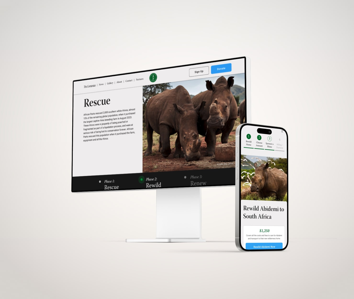
Story-Driven Page Layout
The homepage walks users through the Rhino Rewild process in three narrative sections: Rescue, Rewild, and Renew. Each phase is introduced with a scroll-triggered animation and a small breadcrumb-style tracker that moves with the user, providing orientation and reinforcing the project’s story arc.These lightweight animations—fades, slides, and progress cues—add visual interest while keeping the site accessible and performant.

Load and scroll animations add interest to Rhino Rewild's homepage.
Supplemental Pages
While the homepage is the main storytelling and engagement tool, I also designed several secondary pages to support the campaign:

News: Dynamically updated via CMS to share updates and progress.
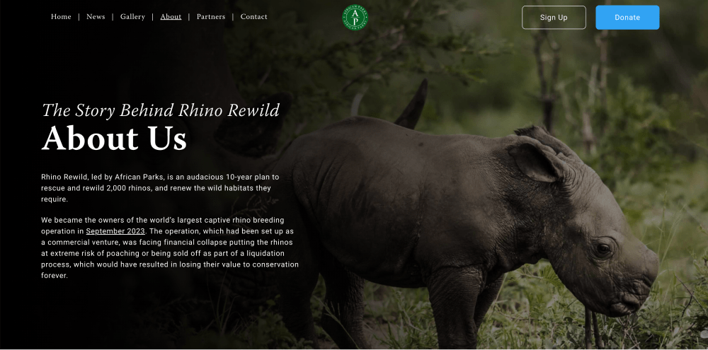
About Us: Features full-bleed imagery and concise text about African Parks’ mission.

Partners: Highlights corporate sponsors and their involvement.
Designing the "rewild a rhino" donation UX
A key goal from the start of the project was to create a donation experience that felt as unique and meaningful as the campaign itself. The core idea: let patrons help fund the relocation of one of 2,000 rhinos being rewilded across various wilderness areas in Africa.These rewilding efforts carry a significant cost—typically over $1,000 per rhino, depending on the destination. This created a unique design challenge: how do we build a system that appeals equally to:
Small donors
Individuals wanting to contribute smaller amounts (under $100), who still want to feel a personal connection to the project.
Large donors
Individuals or organizations able to fully sponsor a rhino’s relocation cost and receive special recognition for their contribution.
UX Solution: A Branching Donation Flow
To serve both audiences, I designed a donation experience that branches at the very beginning, allowing users to choose how they want to participate:
- Group Sponsorship (small donors): Users are taken to a collective funding interface, where they can contribute any amount toward a specific rhino—similar in spirit to a GoFundMe. Progress bars and running totals show how close that rhino is to completing funding.
- Full Sponsorship (large donors): Users are guided to an interim page where they can select from different price tiers based on destination region. They’re then matched with a rhino to sponsor individually, with a personalized profile and story.

This branching flow was first mapped out in mid-fidelity wireframes to align the team and clarify the user journey. As we moved forward, the visual and verbal cues were refined through testing and feedback to improve clarity and conversion across both paths.
Refining the landing page language and presentation
As the donation experience took shape, we iterated on the landing page to clarify the two donation paths, introduce visual drama, and surface campaign progress.


V1: Donation flows described as "Rewild a Rhino" and "Join a Group Rewilding Fund".

V2: This iteration added more visual emphasis on these two distinct options.

V3 Hero: Introduced a full-screen hero composed of hundreds of tiny rhino photos, creating a “2,000 rhinos” visual metaphor. This conveyed the campaign’s scope instantly.

V3 Donation: Rebalanced emphasis: the “Join a Group Fund” card is slightly larger (to welcome small donors), while “Sponsor a Rhino” remains prominent for high-value contributors. Added progress bar at the bottom showing “X of 2,000 rhinos funded” to drive urgency.
Final Touches
It was an important requirement for the project that there was a certain level of visual polish throughout the design. I added a few key interactive animations that helped tell the story of the campaign, as well as create visual interest.
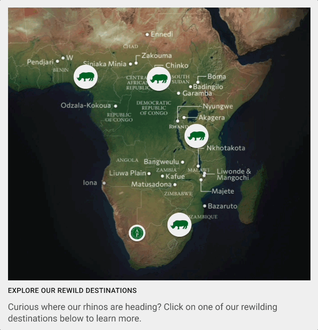
An interactive map feature allowed users to learn more about the campaign, as well as highlighting the difference in "price tiers" for different rhinos.

The landing page hero features a subtle background animation, and remains fixed in place when scrolling down to create a parallax effect. Both these design choices were made to give this page a bit of extra visual polish that was important to African Parks.
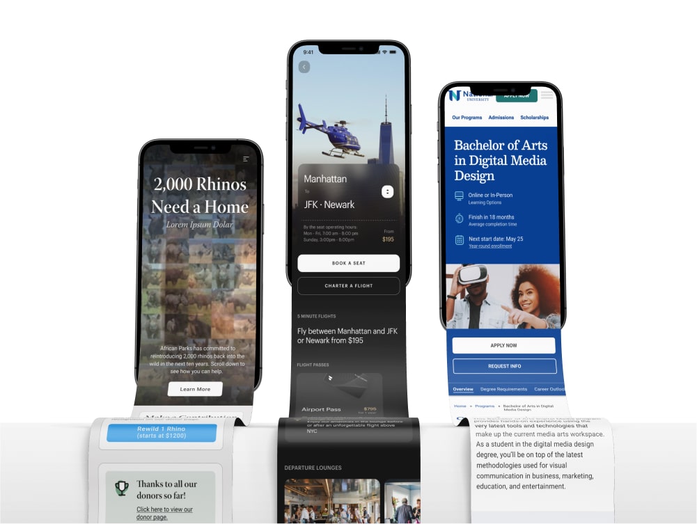
Final Designs
The final designs deliver a streamlined, visually engaging microsite that clearly communicates the mission of Rhino Rewild. Key features include an intuitive donation platform optimized for mobile and desktop, compelling storytelling through impactful imagery and subtle animation, and accessible navigation that guides users effortlessly toward supporting conservation efforts. Feedback from iterative testing informed improvements in layout and interaction, resulting in a design that boosts conversion rates and fosters deeper emotional connection with the cause.

Selected screens from the final desktop designs. Additional features included a breadcrumb navigation to clarify the flow, a billing and payment screen that clarified user choices, and a thank you screen that encouraged social sharing functionality.
Interested in working together?
Have a project I can help with? Have a question about something on my website? Reach out using the form below, or send me an email.